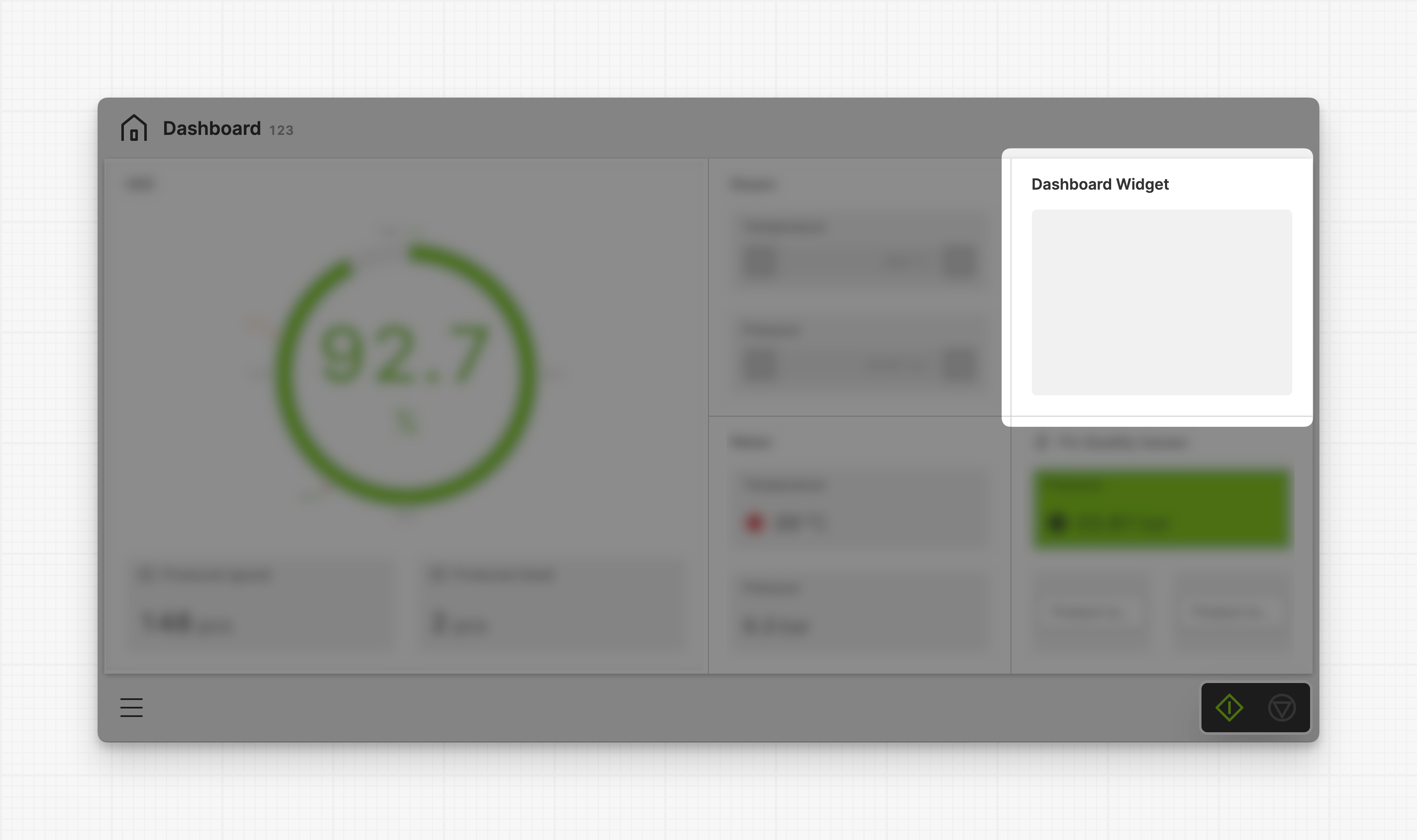
Dashboard Widget
A dashboard widget is an adaptive container that groups related elements and information on a Dashboard Page.
Dashboard widgets can contain a wide variety of HELIO Element Types, including Gauge, Magic Input or Magic Output.
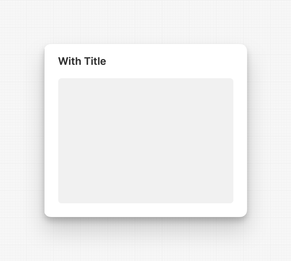
Properties
Container
This icon will be displayed next to the element's label on pages that support it, like the Dashboard Page. An Element can make use of the icon to:
- Provide more context to add meaning
- Improve recognition and discoverability, especially on larger pages
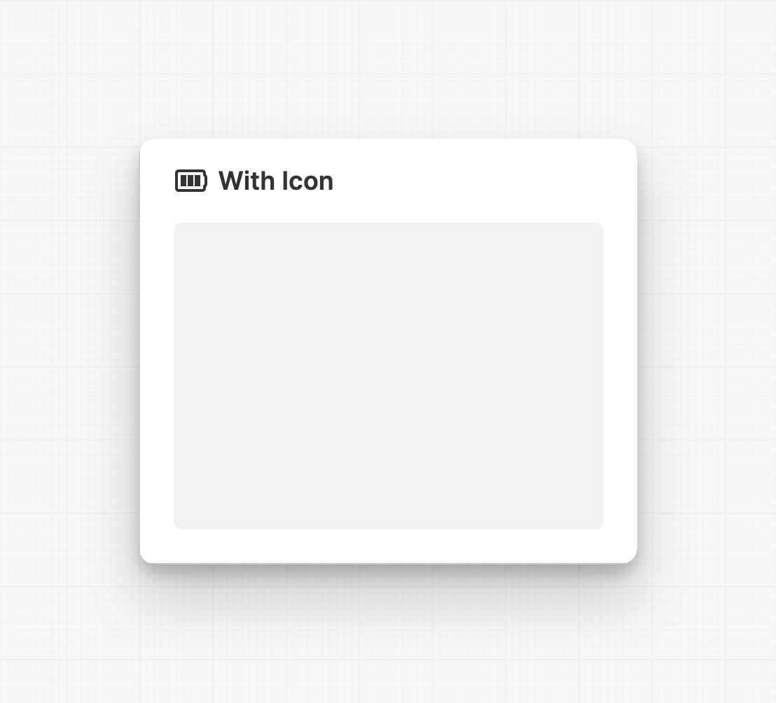
Main Action
Button that will be displayed in the upper right corner of the widget. By pressing it, users can execute an action.

Action that gets executed when clicking the button. Use it to:
- Open maximized versions of your widget content using the Open Page as Overlay Action.
- Navigate to other pages using the Navigate to Page Action.
- Execute logic on your PLC using the Write Data Variable Action or Call Data Method Action
Custom Layout
Declare a custom layout for this widget. It will be used
whenever possible, otherwise HELIO will use a default layout as a fallback. Be
aware that this feature is still in Beta, so please use it with caution!
This custom layout has the highest priority. If there is not enough space or the layout does not match the number of elements, the best-fitting alterative layout will be automatically applied.
Display Condition
true or false you're good to go.