Linear Flow
A Linear Flow visualizes data flows, processes, or the modules of a machine in a straightforward linear format that is easy to understand. It consists of several Linear Flow Modules.
Get Started With the Linear Flow
To watch this embedded YouTube video, you need to accept the marketing cookies.
Examples
A Linear Flow that Visualizes Important Components of a Machine
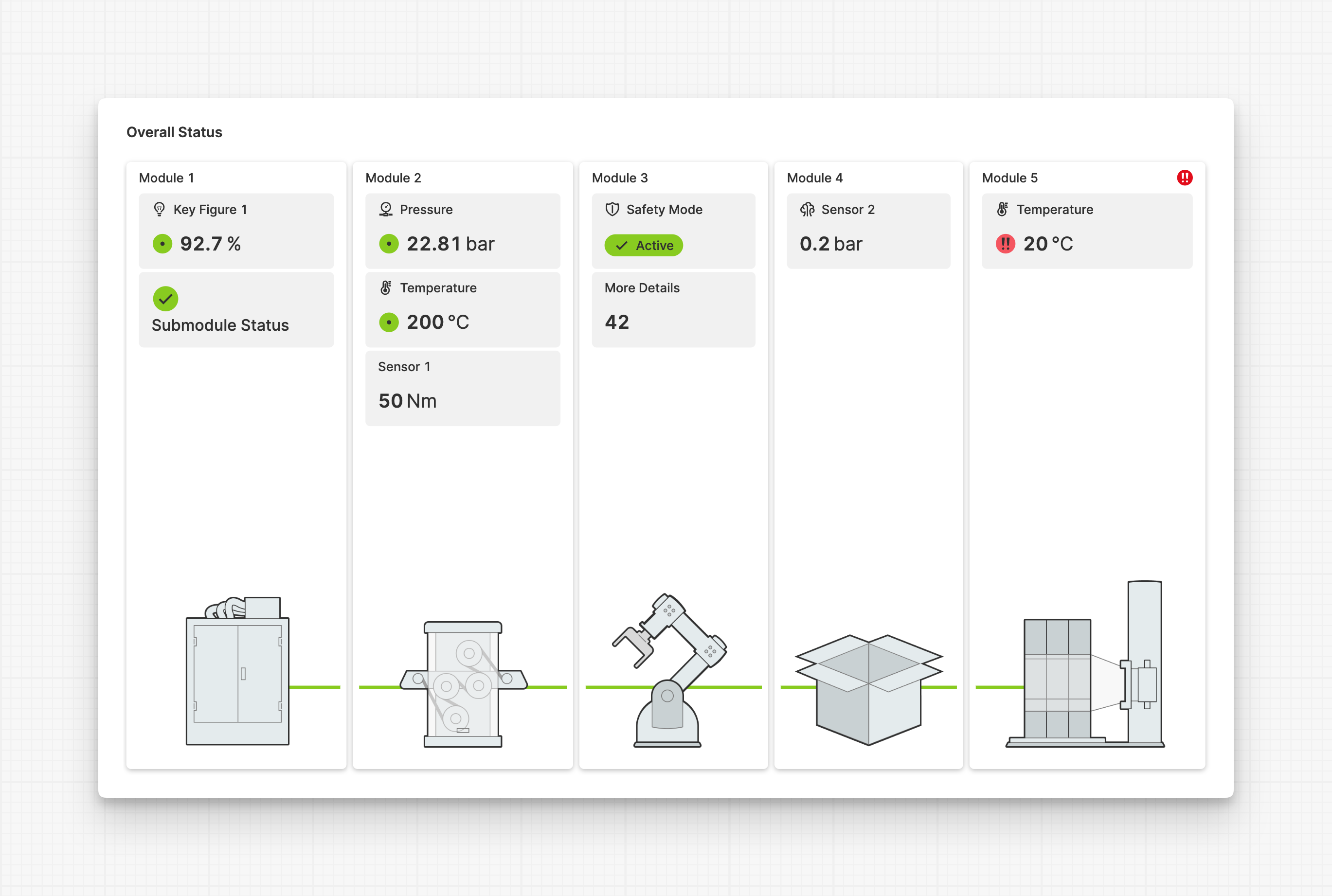
Here you can see a machine that consists of 5 modules. Each module reports its most important key figures. The last module reports an alarming status using an output, as well as the overall module status.
Anatomy
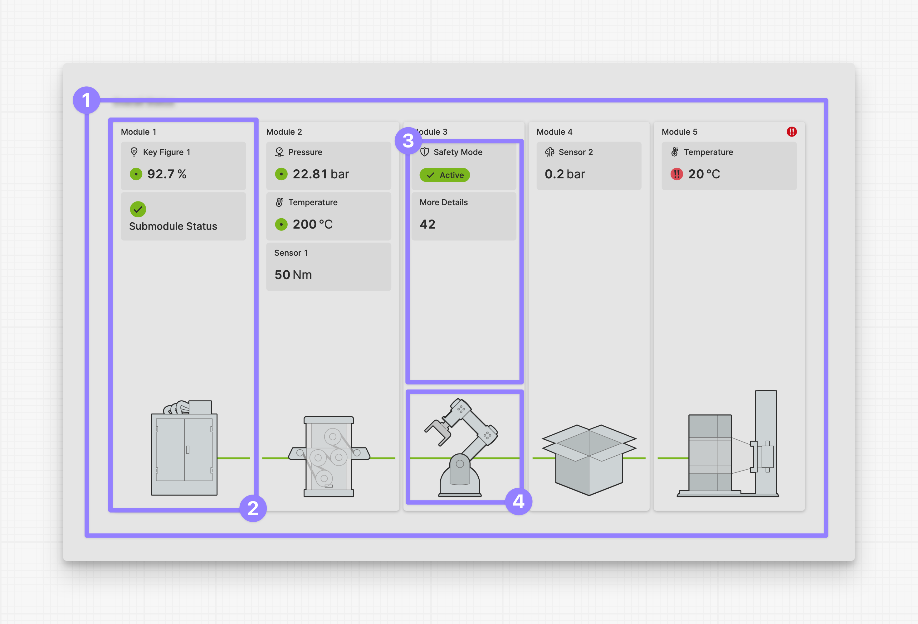
Linear Flow
Module
Module Children
Module Image
Guiding Design Principles of the Linear Flow
Clarity and guidance over physical accuracy
In many HMIs, we see a detailed display of machines with many options. While this may work well for the machine manufacturer, it may not be the best way to view and operate a machine. Because to operators the machine is mostly a black box. Seeing all the details of the inner workings can be overwhelming.
Operators usually only need the most important information about the machine modules they care about.
That’s why the Linear Flow gives you an overview of the most important elements of a machine, or a data flow with the most important
Let horizontal swiping and scroll snapping work their magic – no need to worry if it doesn't fit correctly
Getting this linear view to fit perfectly on every single screen size out there? Trust us, it's more trouble than it's worth. Instead, let it expand to meet the full width at first. If it gets too wide, no worries - users can just swipe through it. It works like a charm, especially on touch devices. Plus, HELIO ensures everything snaps into place just right.
Read only first – manipulation can be handled in overlays
Adding interactive elements to a detailed view like this will only make it more visually cluttered. To simplify the view, highlight only the most important figures and statuses. Place any interactive elements on separate pages that can be shown as a layer over the main content using the Open Page as Overlay Action
Properties
Sizing
Image Height
Height that gets applied to all images used in this flow. To break it down into a simple rule:
- If you plan to stick to the default height of 120 device independent CSS pixels. Make sure to create a canvas in your design tool that is 120x120 wide.
- If you plan to support retina screens or mobile devices you should switch
to a retina version. Make sure to adjust the export settings in your design
tool and choose
2xas an output format.
UX Tips & Tricks: Use the same height for all your image
This will simplify adjusting each module. You can use different widths,
but you must remember to change the module's width from Default to
Fixed.
Collapsible Modules
Initial State
Select wether the initial state of all collapsible modules should be collapsed or expanded.
Display Condition
true or false you're good to go.