Linear Flow Module
About
A single component inside of a Linear Flow. It can represent a part of a machine or a processing step. Let your imagination run wild.
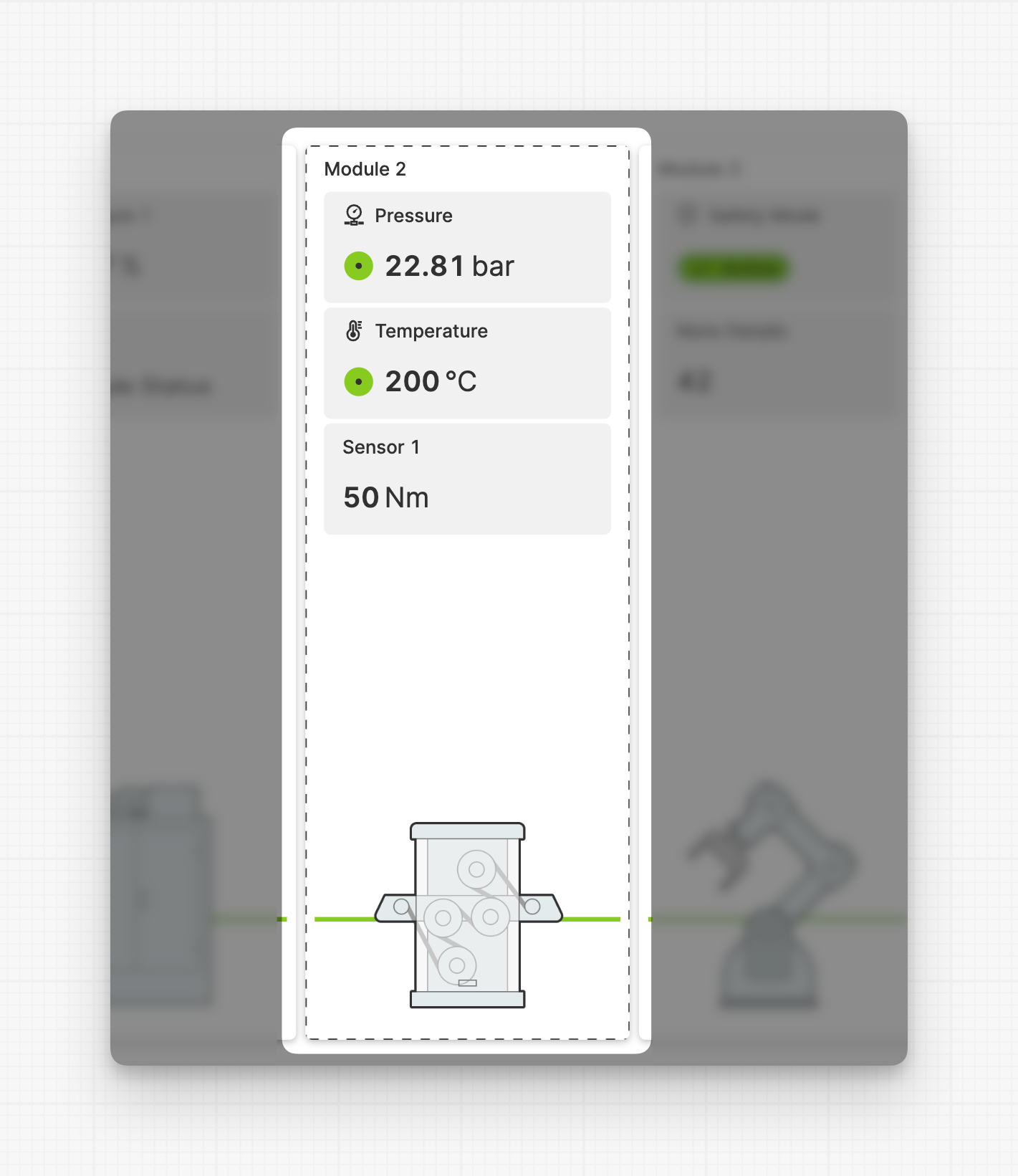
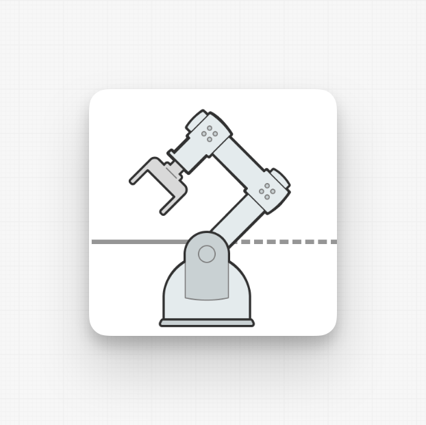
Example: Module with three Magic Output,
an image and a solid Outlet that also communicates its status.
Anatomy
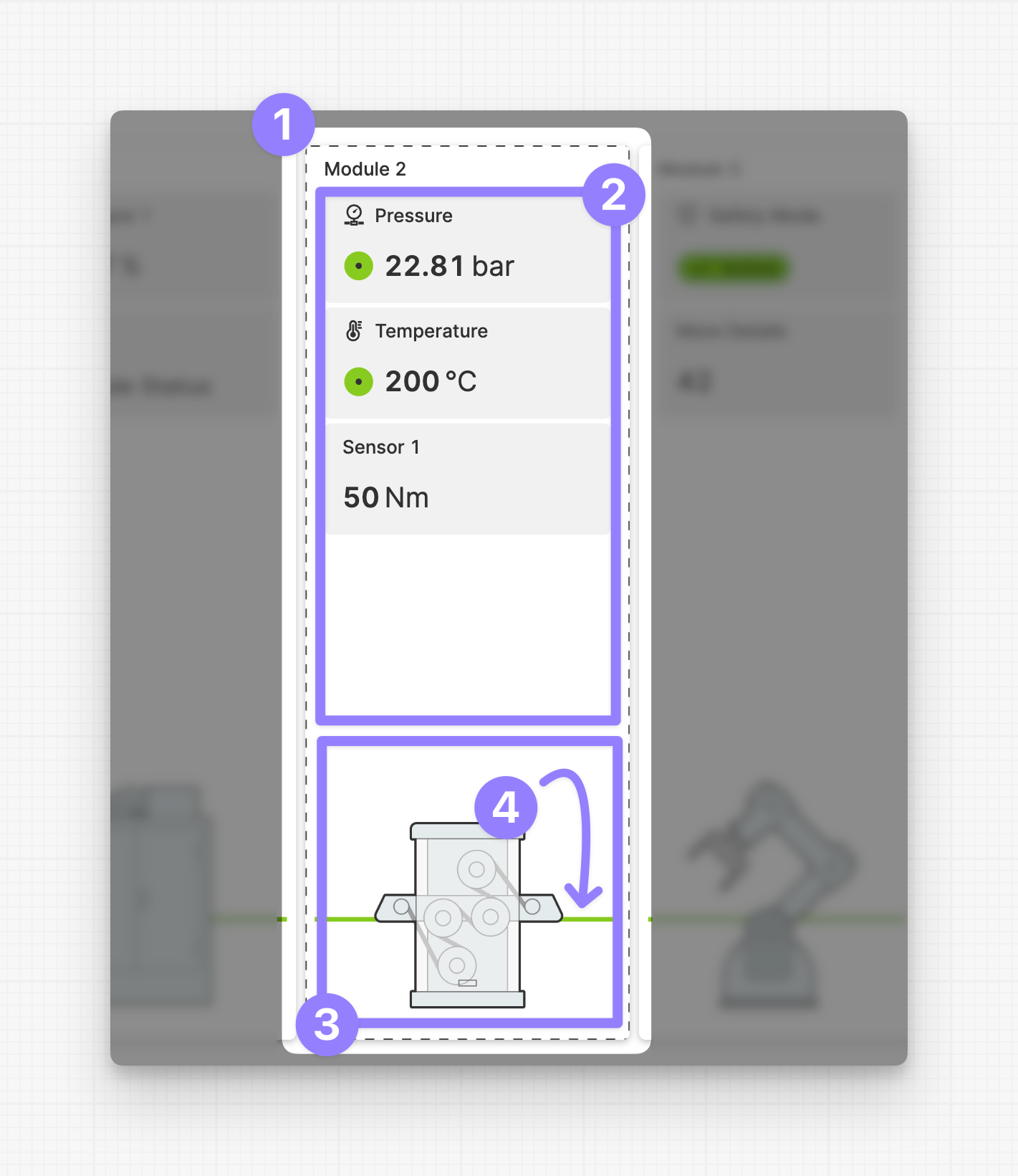
Module
Module Children
Module Image
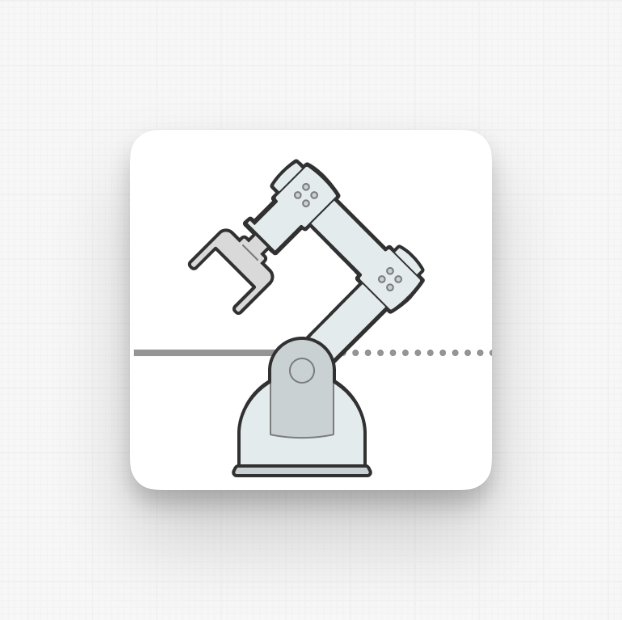
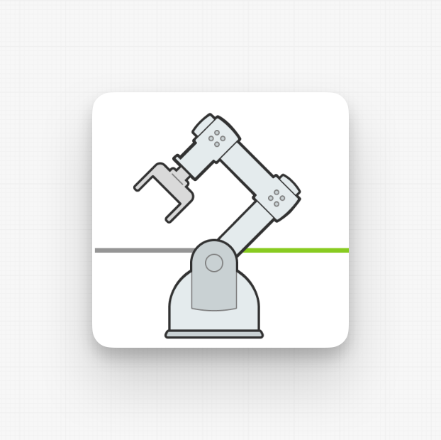
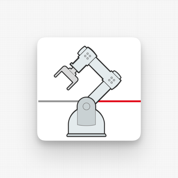
Outlet
Guiding Design Principles of the Linear Flow
Clarity and guidance over physical accuracy
In many HMIs, we see a detailed display of machines with many options. While this may work well for the machine manufacturer, it may not be the best way to view and operate a machine. Because to operators the machine is mostly a black box. Seeing all the details of the inner workings can be overwhelming.
Operators usually only need the most important information about the machine modules they care about.
That’s why the Linear Flow gives you an overview of the most important elements of a machine, or a data flow with the most important
Let horizontal swiping and scroll snapping work their magic – no need to worry if it doesn't fit correctly
Getting this linear view to fit perfectly on every single screen size out there? Trust us, it's more trouble than it's worth. Instead, let it expand to meet the full width at first. If it gets too wide, no worries - users can just swipe through it. It works like a charm, especially on touch devices. Plus, HELIO ensures everything snaps into place just right.
Read only first – manipulation can be handled in overlays
Adding interactive elements to a detailed view like this will only make it more visually cluttered. To simplify the view, highlight only the most important figures and statuses. Place any interactive elements on separate pages that can be shown as a layer over the main content using the Open Page as Overlay Action
Properties
General
Label
The label of the linear flow module.
Description
The description of the linear flow module. Will be displayed less prominent than the label.
On click
Triggered once the user has clicks/touches the whole module.
Is Collapsible
Determine wether or not a module should be collapsible. This will not automatically set the module to be collapsed if true. Use the Toggle Linear Flow Collapsible action to switch between collapsed and expanded stated for all collapsible modules.
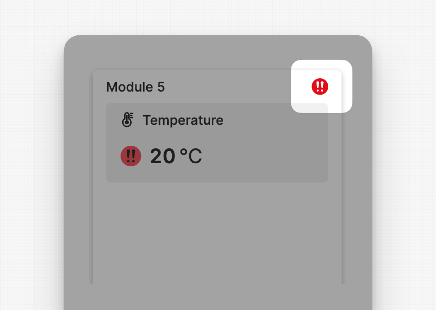
Apply Status
From Value with Ranges
Use this option, if the variable linked to Value provides status information. This will allow you to automatically apply the status from Value to indicate the quality of the value as either Good, Warning, Critical or Accent.
Learn more with the following resources:
Manually
-> For more information: visit Status.
Minimal Width
Set the minimal width for this Linear Flow Module in device independent CSS pixels.
Visualization
Choose whether to use an image or an icon to visualize this Linear Flow Module.
Image
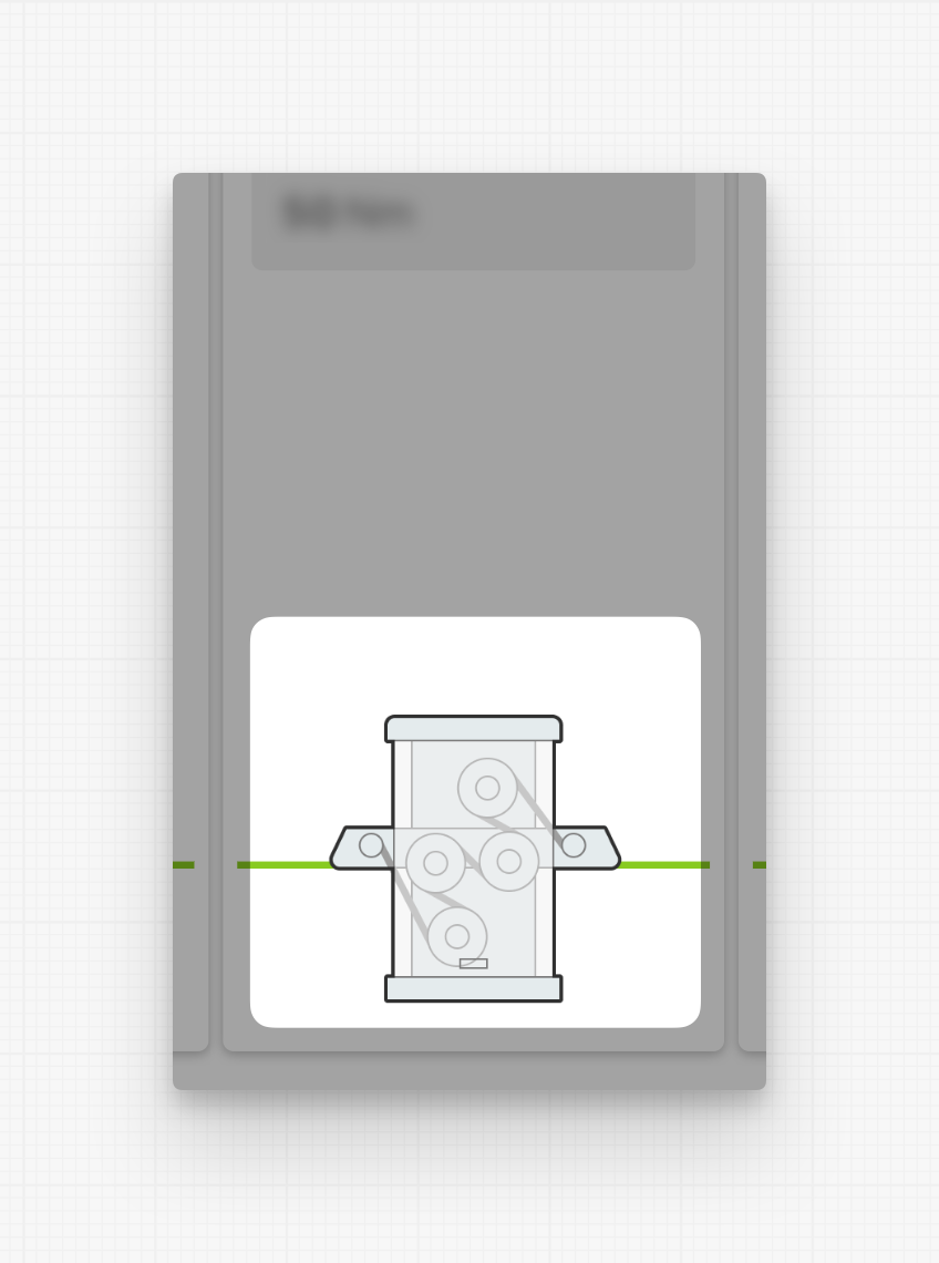
Image Scale
Will scale the image up or down. Default scale is at 100%.
Outlet
Style


Display Condition
true or false you're good to go.