Trend
A Trend visualizes the progression of a numerical value in a line chart. It
animates over time and is designed to be used as a visual aid in tracking
changes or patterns.
Examples
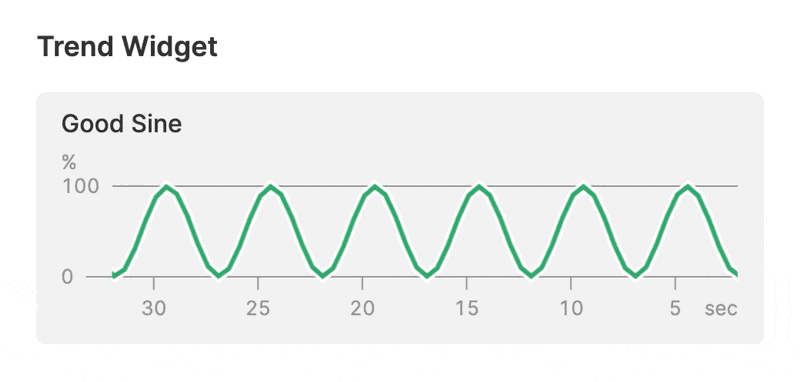
Trend with a single value
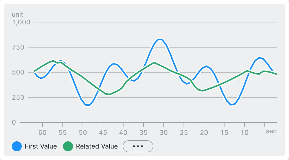
Trend with multiple values and a legend
When multiple trend lines are visible, operators can toggle each one on or off by clicking their entries in the legend.
Paused Trend with a Ruler
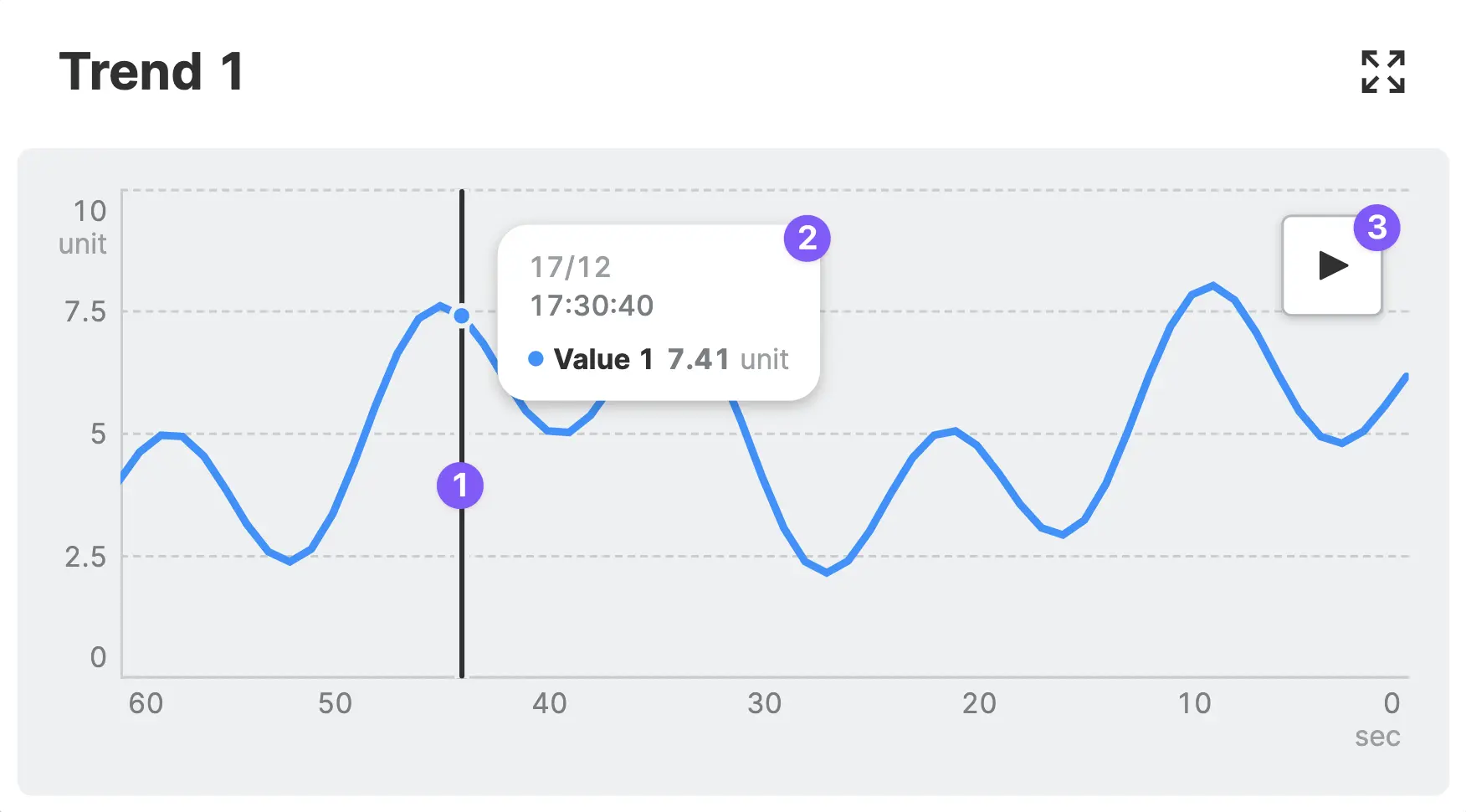
Click anywhere within the
Trendwhile in Test-Mode to pause the Trend and display a ruler at the selected position.View the exact value of the
Trendat the selected position. When there is more than one trend line within the trend, all values will be displayed.Resume the
Trend. This will skip ahead to the live view of the Trend.
Properties
Values
Add a single value to visualize a single trend. Add multiple values to compare several trend lines simultaneously. This is useful for monitoring and identifying patterns across multiple values, as well as for visualizing their relationships with each other. Each value features the following properties:
Name
Choose a name for the trend line, this will be displayed within the legend if you choose to enable it.
Color
Choose a color for the trend line.
Path
Connect the this property to a Data Variable.
Ensure the Linked Variable Meets These Requirements
-
History
Needs to be activated for this variable in order to store historical data, which can then be used for the trend chart. -
Minimum and Maximum Values
The range of the Y-axis is determined by both the minimum and maximum of the linked variable. If these are not set, the trend will default to a Y-Axis range of 0-100.
Container
This icon will be displayed next to the element's label on pages that support it, like the Dashboard Page. An Element can make use of the icon to:
- Provide more context to add meaning
- Improve recognition and discoverability, especially on larger pages
X-Axis
Determines the range of time that is displayed on the X-axis of the trend chart. It is important to select a time range that is appropriate for the data being displayed, as displaying too much or too little data can make it difficult to interpret the trend.
Choose an Appropriate Time Range!
Remember not to select a time range that exceeds the period specified in the History settings.
Enable Legend
Place a legend below your trend. This feature is especially useful for visualizing multiple values.
Enabling the legend also enables operators to toggle the visibility of trend lines.
Display Condition
true or false you're good to go.