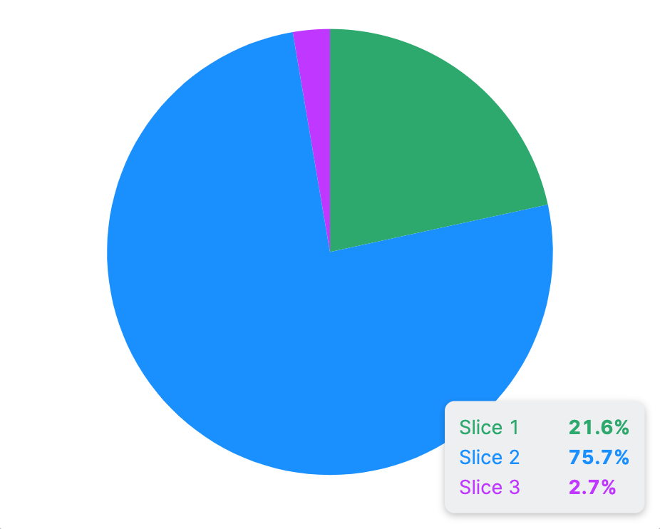
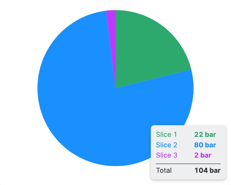
Pie Chart
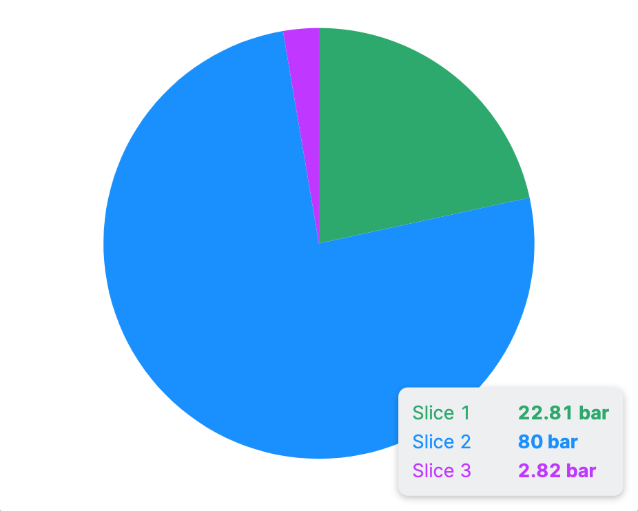
A pie chart is a good tool to show how different values relate to each other. Each category is a slice of the pie, so you can see how big each category is compared to the others. This way, operators can quickly grasp the content of a dataset.
Properties
Slices
The following properties are featured by each slice:
Provides context and information to operators, guiding them and helping them understand the meaning of the value of this particular element.
The current value that should be displayed on the Slice, usually this will be bound to a Data Variable Types.
Container
This icon will be displayed next to the element's label on pages that support it, like the Dashboard Page. An Element can make use of the icon to:
- Provide more context to add meaning
- Improve recognition and discoverability, especially on larger pages
Provides context and information to operators, guiding them and helping them understand the value of this particular element. A good label instills confidence in operators when making adjustments.
Will be displayed underneath the element. This description provides additional guidance or instructions for operators manipulating the element. It expands on the label by offering supporting details and clarifying what the element represents or how it behaves. It provides an opportunity to offer more detailed context regarding the potential impact of changes or further instructions on the desired input format.
Chart Legend
Display Condition
The Display Condition controls the visibility of an element or page for the current user. The condition can be set to different types of Dynamic Property – as long as the the type returns
true or false you're good to go.