Radial Bars
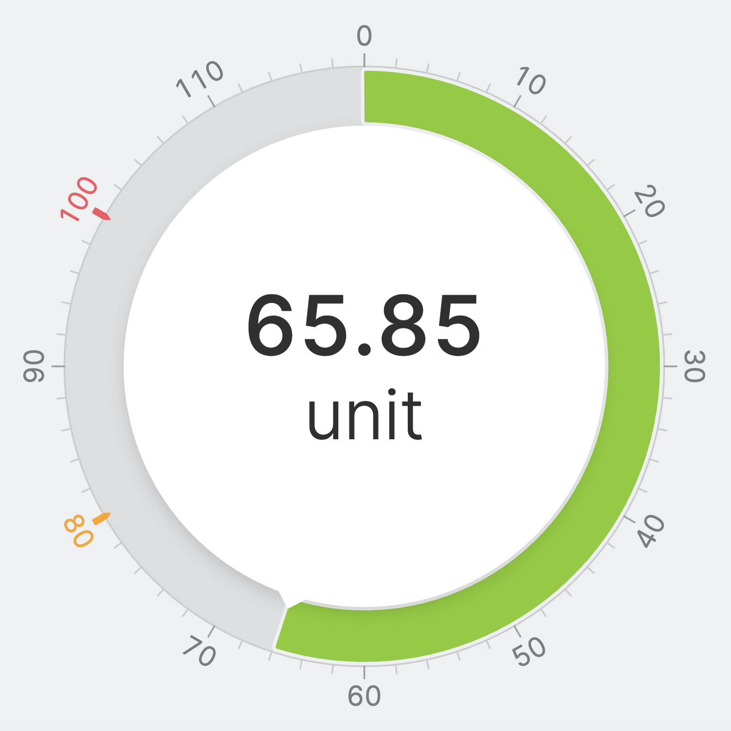
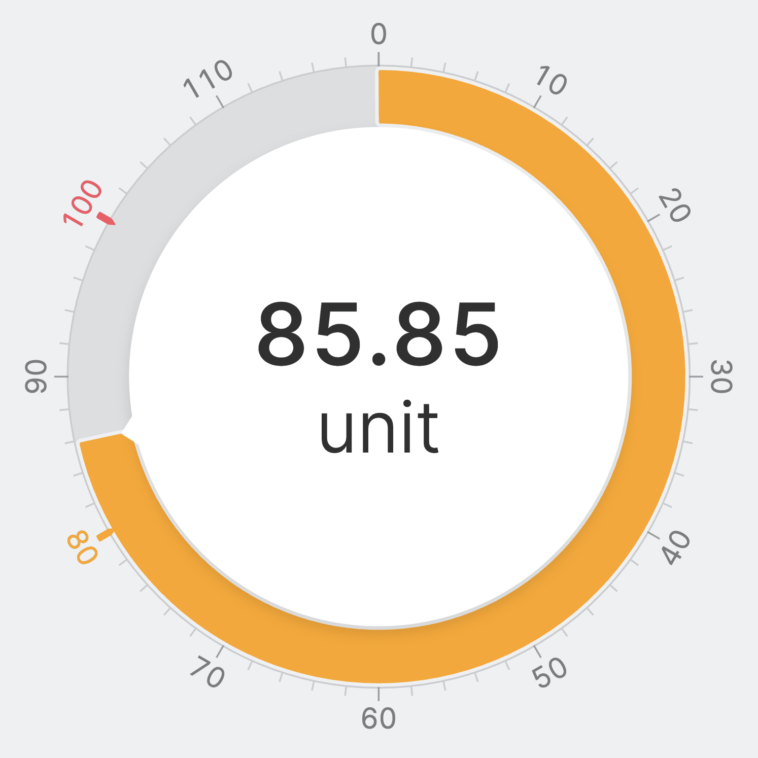
A Radial Bar displays a numeric value as a filled arc. Its color reflects
the current status, making it easy for operators to assess state at a glance.
Unlike the Gauge, which provides visual feedback on critical sections of
the range, the Radial Bar focuses on communicating the current status of a
single value.
Properties
General
The data source for this Radial Bar. Connect a numeric Data Variable (Dynamic Property).
Requirements When Using a Data Variable (Dynamic Property)
-
Minimum and Maximum Values
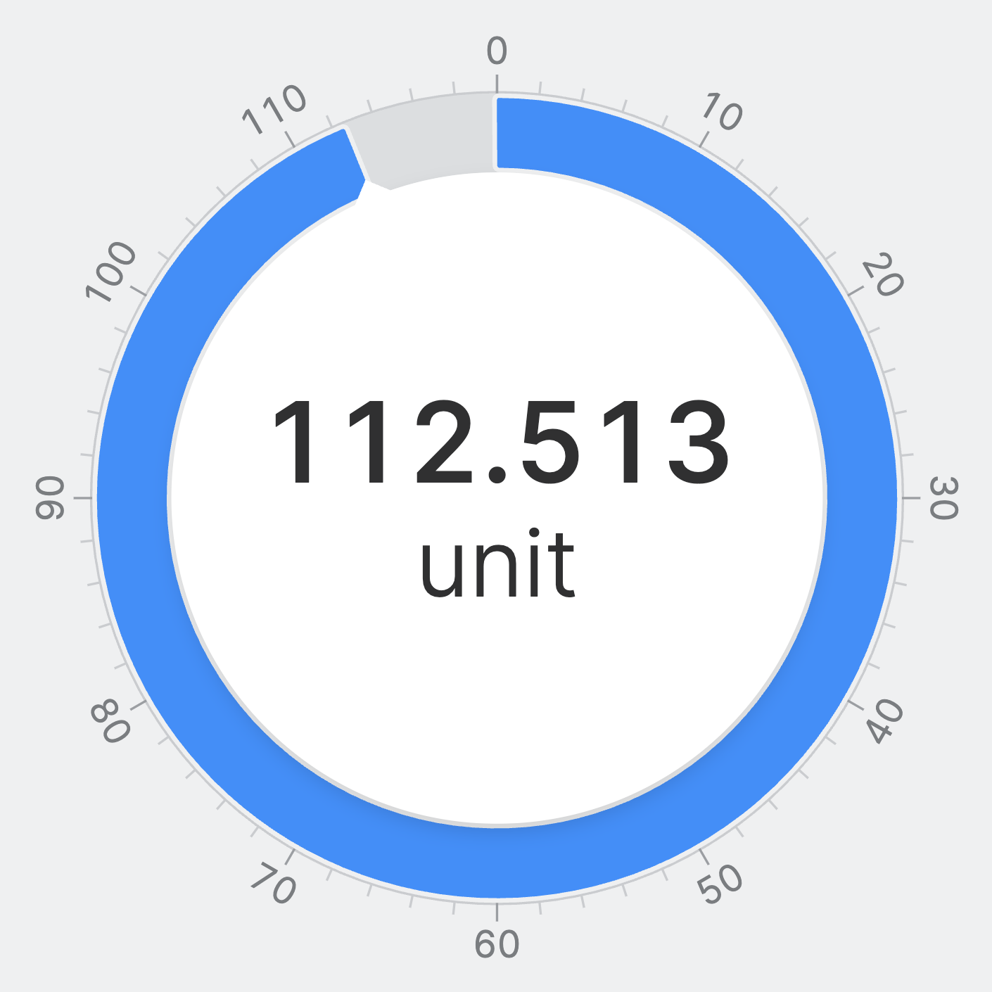
The arc range is determined by the minimum and maximum of the linked variable. - Use the
Rangesproperty of the variable to drive the status color.
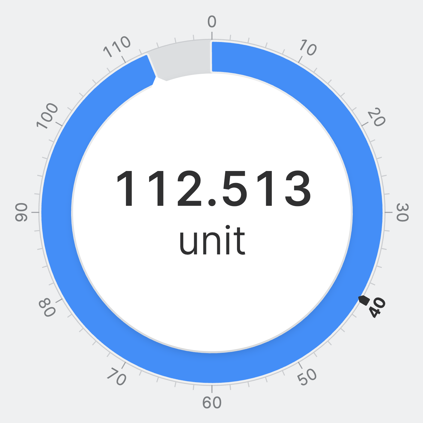
An optional target value displayed as a marker on the arc. Connect a numeric Data Variable (Dynamic Property).
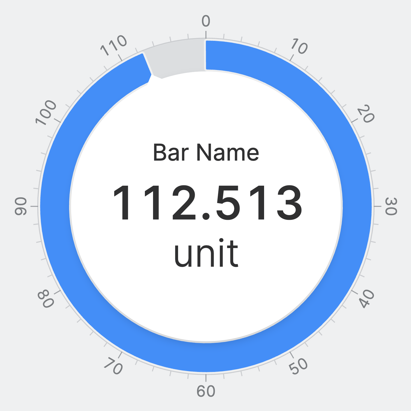
Container
This icon will be displayed next to the element's label on pages that support it, like the Dashboard Page. An Element can make use of the icon to:
- Provide more context to add meaning
- Improve recognition and discoverability, especially on larger pages
Action
Button that will be displayed in the upper right corner of the element. By pressing it, users can execute an action.
Action that gets executed when clicking the button. Use it to:
- Open overlays that provide additional context or detailed controls for this element using the Open Page as Overlay Action.
- Navigate to other pages using the Navigate to Page Action.
- Execute logic on your PLC using the Write Data Variable Action or Call Data Method Action
Ticks
Control the number of ticks that the radial bar will display.
Auto
HELIO will calculate a fitting number of ticks for you.
Density
Select the number of ticks yourself by setting a density. Choose between low, medium and high.
Interval
Precisely select the number of ticks yourself by setting intervals. Choose how often a tick should appear and how often a label should appear.
Segments
Precisely select the number of ticks yourself by setting segments. Choose how many ticks should appear and how often a label should appear.
Apply Status
From Value with Ranges
Use this option, if the variable linked to Value provides status information. This will allow you to automatically apply the status from Value to indicate the quality of the value as either Good, Warning, Critical or Accent.
Learn more with the following resources:
Manually
-> For more information: visit Status.
Display Condition
true or false you're good to go.