Value Bar
About
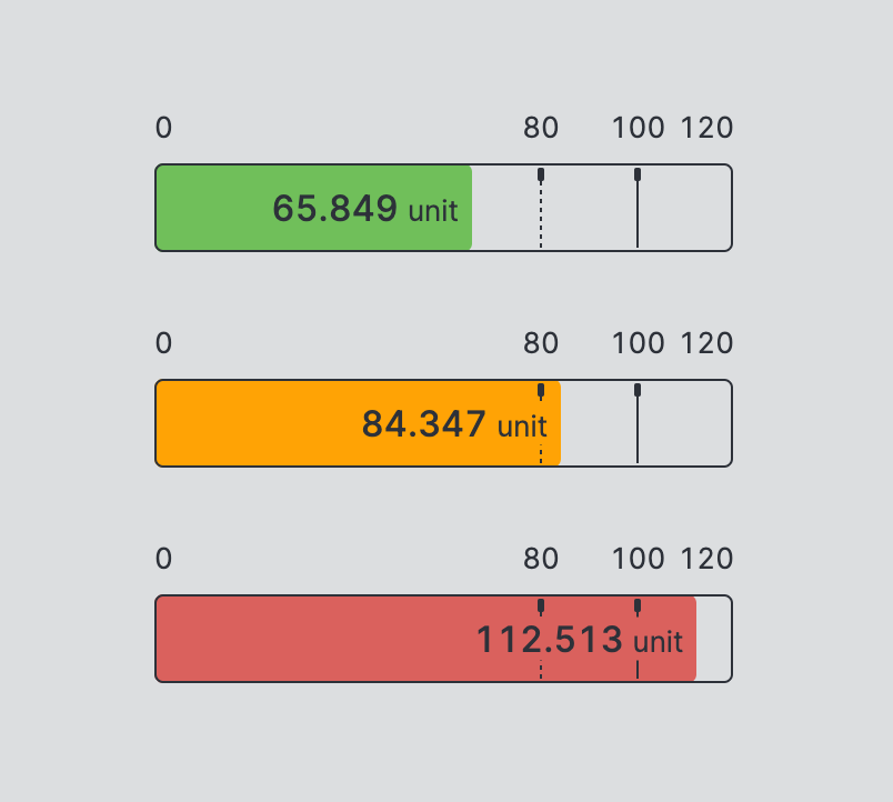
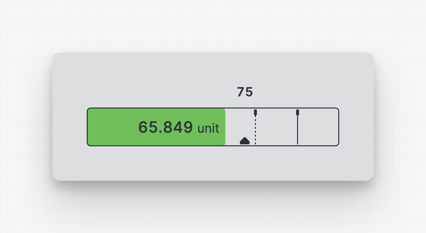
A Value Bar simplifies the interpretation of numerical values by displaying
the current value, its range, and highlighting good, alarming, or critical
areas within the range.
Properties
General
Value
The current value that should be displayed by the element, usually
this will be bound to a Data Variable.
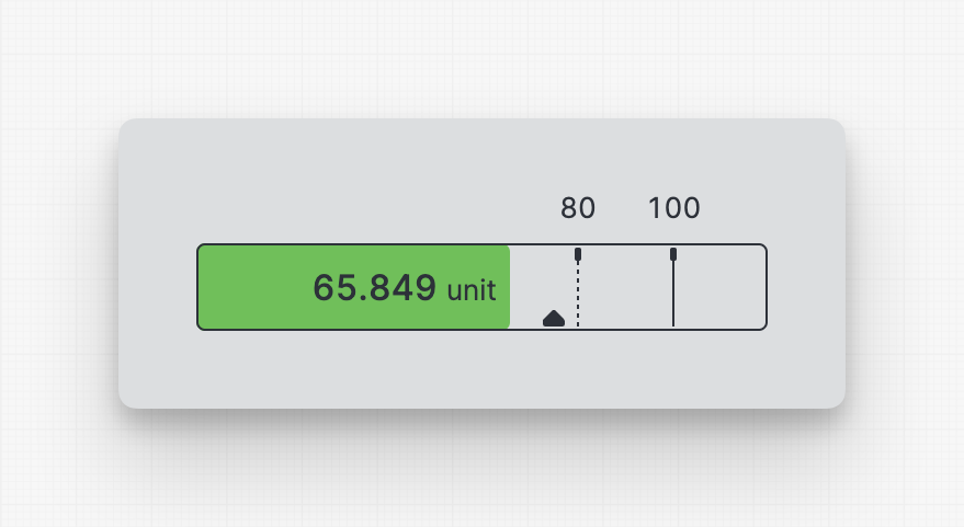
Container
This icon will be displayed next to the element's label on pages that support it, like the Dashboard Page. An Element can make use of the icon to:
- Provide more context to add meaning
- Improve recognition and discoverability, especially on larger pages
Provides context and information to operators, guiding them and helping them understand the value of this particular element. A good label instills confidence in operators when making adjustments.
Will be displayed underneath the element. This description provides additional guidance or instructions for operators manipulating the element. It expands on the label by offering supporting details and clarifying what the element represents or how it behaves. It provides an opportunity to offer more detailed context regarding the potential impact of changes or further instructions on the desired input format.
Action
Button that will be displayed in the upper right corner of the element. By pressing it, users can execute an action.
Action that gets executed when clicking the button. Use it to:
- Open overlays that provide additional context or detailed controls for this element using the Open Page as Overlay Action.
- Navigate to other pages using the Navigate to Page Action.
- Execute logic on your PLC using the Write Data Variable Action or Call Data Method Action
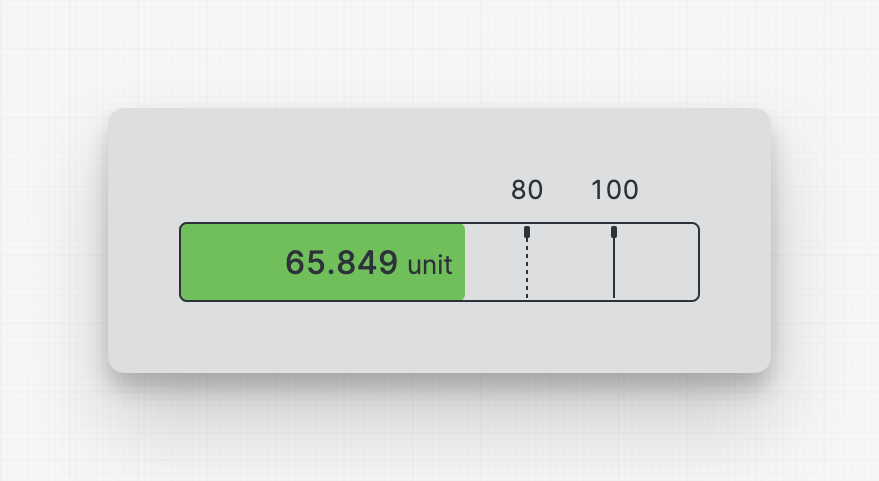
Display Labels
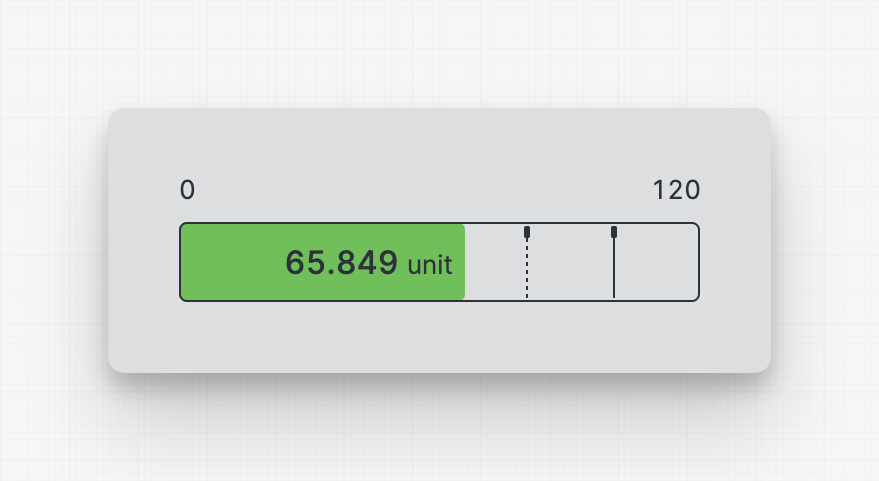
Minimum and maximum
Display Condition
The Display Condition controls the visibility of an element or page for the current user. The condition can be set to different types of Dynamic Property – as long as the the type returns
true or false you're good to go.