Magic Input
About
The Magic Input can be a real time-saver when you're creating pages that
manipulate data from your PLC. It automatically adapts to the
Data Variable Types of the
variable you're linking to and provides operators with
a UI component that fits best.
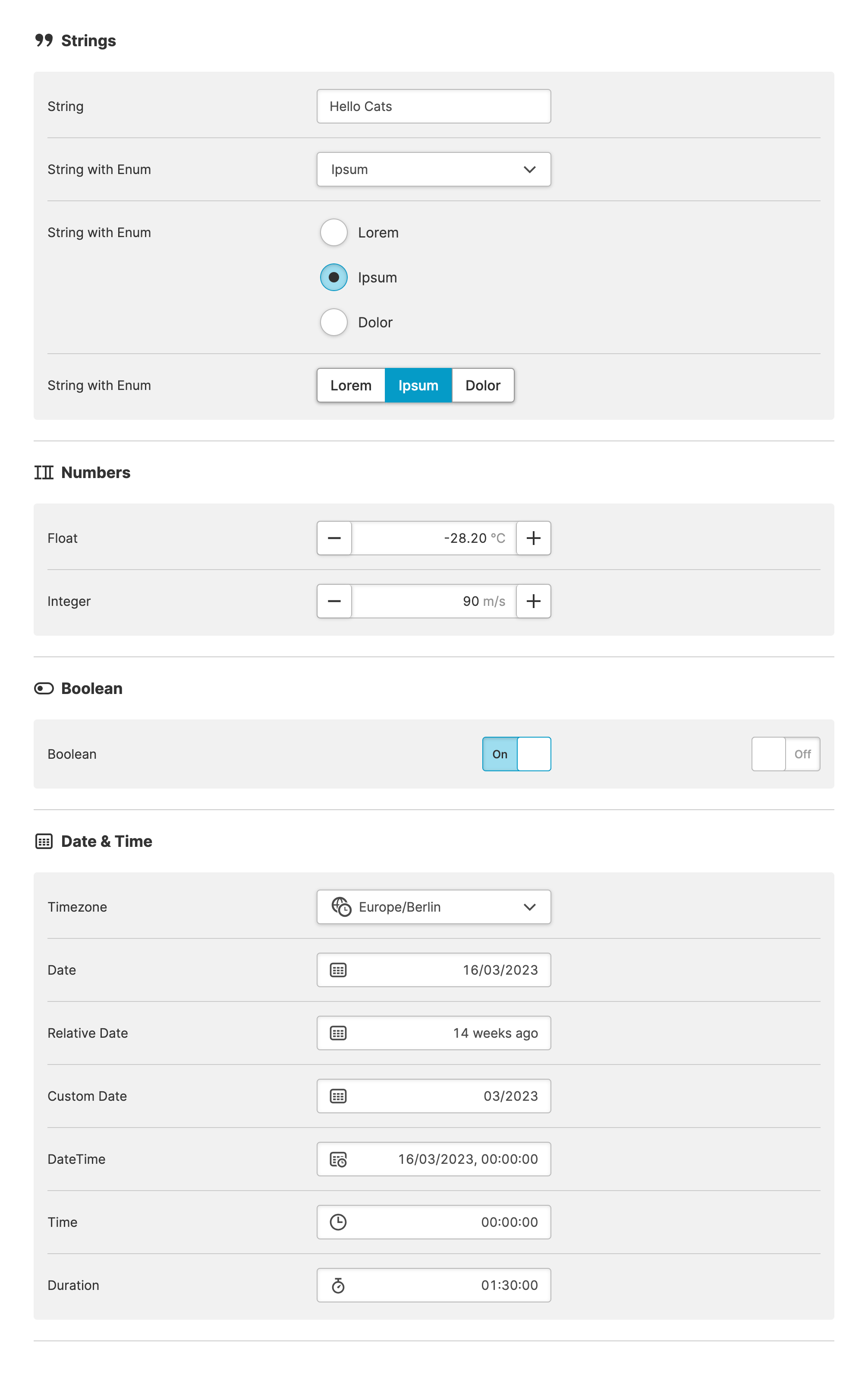
The Magic Input simplifies the creation of HMIs that modify data variables from sources such as your PLC. HELIO automatically adapts to the of the variables being linked and presents a UI component that best fits the shape of your data.
For example, if an imported variable from your PLC is typed as Integer, the Magic Input component will display a Numeric Stepper.
Validations
The Magic Input not only considers the data type, but also other
features of data variables in order to validate all data entered by
operators.
For example, Minimum and Maximum Values and Enumerations help prevent operators from inputting values that the machine can't handle.
Do Not Rely Solely on Client-Side Validation!
Client-side validation greatly improves the user experience for operators. However, your backend, e.g. your PLC should still reject invalid values. You should never rely solely on client-side validation of input data.
Properties
General
Container
This icon will be displayed next to the element's label on pages that support it, like the Dashboard Page. An Element can make use of the icon to:
- Provide more context to add meaning
- Improve recognition and discoverability, especially on larger pages
Main Action
Button that will be displayed in the upper right corner of the element. By pressing it, users can execute an action.
Action that gets executed when clicking the button. Use it to:
- Open overlays that provide additional context or detailed controls for this element using the Open Page as Overlay Action.
- Navigate to other pages using the Navigate to Page Action.
- Execute logic on your PLC using the Write Data Variable Action or Call Data Method Action
Display Condition
true or false you're good to go.