Switch
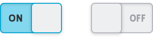
A Switch essentially serves as a visual for users, allowing them to
switch between two states, usually "on" and "off".
It's typically used when the user needs to make a binary choice, such as enabling or disabling a feature or setting. It offers a clear visual cue of the current state and is an intuitive way for users to interact with the interface.
Properties
General
Container
This icon will be displayed next to the element's label on pages that support it, like the Dashboard Page. An Element can make use of the icon to:
- Provide more context to add meaning
- Improve recognition and discoverability, especially on larger pages
Main Action
Button that will be displayed in the upper right corner of the element. By pressing it, users can execute an action.
Action that gets executed when clicking the button. Use it to:
- Open overlays that provide additional context or detailed controls for this element using the Open Page as Overlay Action.
- Navigate to other pages using the Navigate to Page Action.
- Execute logic on your PLC using the Write Data Variable Action or Call Data Method Action
Control Type
Select the control type for this boolean state input. You can choose between a switch and a checkbox.
Alignment
Decide on the alignment of your input, either to the left, in the center or to the right.
Display Condition
true or false you're good to go.