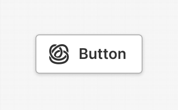
Button
About
Properties
General
Icon
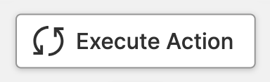
Optional icon that will be displayed before the caption. Icons are visual cues that quickly let users know what the button does. Compared to text, the human brain can process them much faster. In other words, they help users understand more quickly and, above all, recognize what the button is for more rapidly when using a button for the second or third time. So, an icon is particularly useful for power users who regularly use certain pages and buttons.

UX Tips & Tricks: Icons and State
If your button switches between states, do not use the icon to
indicate this status. Instead, use an additional Magic Output on your
page to show the current state. Instead, use the caption and icon on the
button to let operators know what state the button will change to.
UX Tips & Tricks: Naming Buttons
Don't!
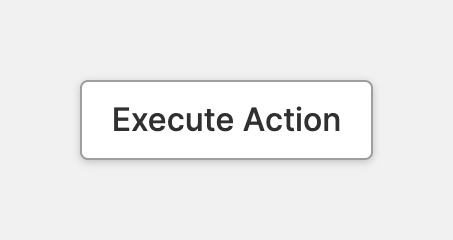
- Avoid using generic labels, such as "Ok", as captions for your buttons.
- These labels fail to clearly communicate the button's function to operators.
Do
- Instead, describe the action being invoked using a few simple words.
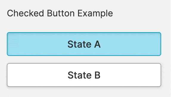
If your button activates an important state or mode of your machine, it is helpful to indicate when the feature is active. Use this property to let operators know that the state triggered by the button is active.
UX Tips & Tricks: Checked vs. Pressed
This state should not be confused with the pressed state. A button that uses this property can be regarded as another form of a checkbox or radio button.
Container
This icon will be displayed next to the element's label on pages that support it, like the Dashboard Page. An Element can make use of the icon to:
- Provide more context to add meaning
- Improve recognition and discoverability, especially on larger pages
Action
Click
On click
Triggered once operators click or touch the element and release the Pointer within the boundaries of it. If you release the Pointer outside of the element, the click event will not trigger. This is a safety mechanism to prevent accidental actions.
On low-end touch screens, particularly resistive ones, this can sometimes lead to undesirable effects. If you encounter this and you are are running mission-critical HMIs, we strongly recommend investing in better hardware for the safety of your operators.
Hold & Release
On down
Action that is triggered once operators click or touch the button.
Repeat while holding
Action that is triggered while operators hold the button.
On Release
Action that is triggered while operators release the click or touch over the button.
Hold repeat interval
Time interval between the execution of the Repeat while holding actions.
User Guidance
Assist operators in distinguishing between actions. Pressing a button on a machine can do different things. A good button tells users how important an action is. That's why there is a "Prioritization" option. It helps users separate important actions from less important ones.
Prioritization
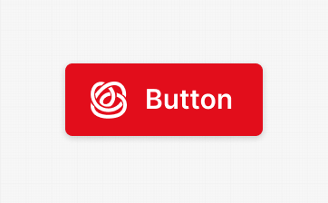
Primary Action
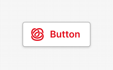
Secondary Action
A secondary button triggers one of several actions on the current page. In addition to a primary action, there should only be a few of those secondary actions. As a rule of thumb, a screen should not contain more than 7 such actions. Anything else quickly leads to confusion and frustration for users.
Consequences
Advice on When to Be Careful
A good button informs users if its action can potentially be dangerous or harmful. Use this property to help users distinguish between potentially harmful actions and actions that pose no risk of harm.
Destructive Action - Primary
Alignment


Select whether your button should occupy the available space or align left, right, or in the center.
Display Condition
true or false you're good to go.