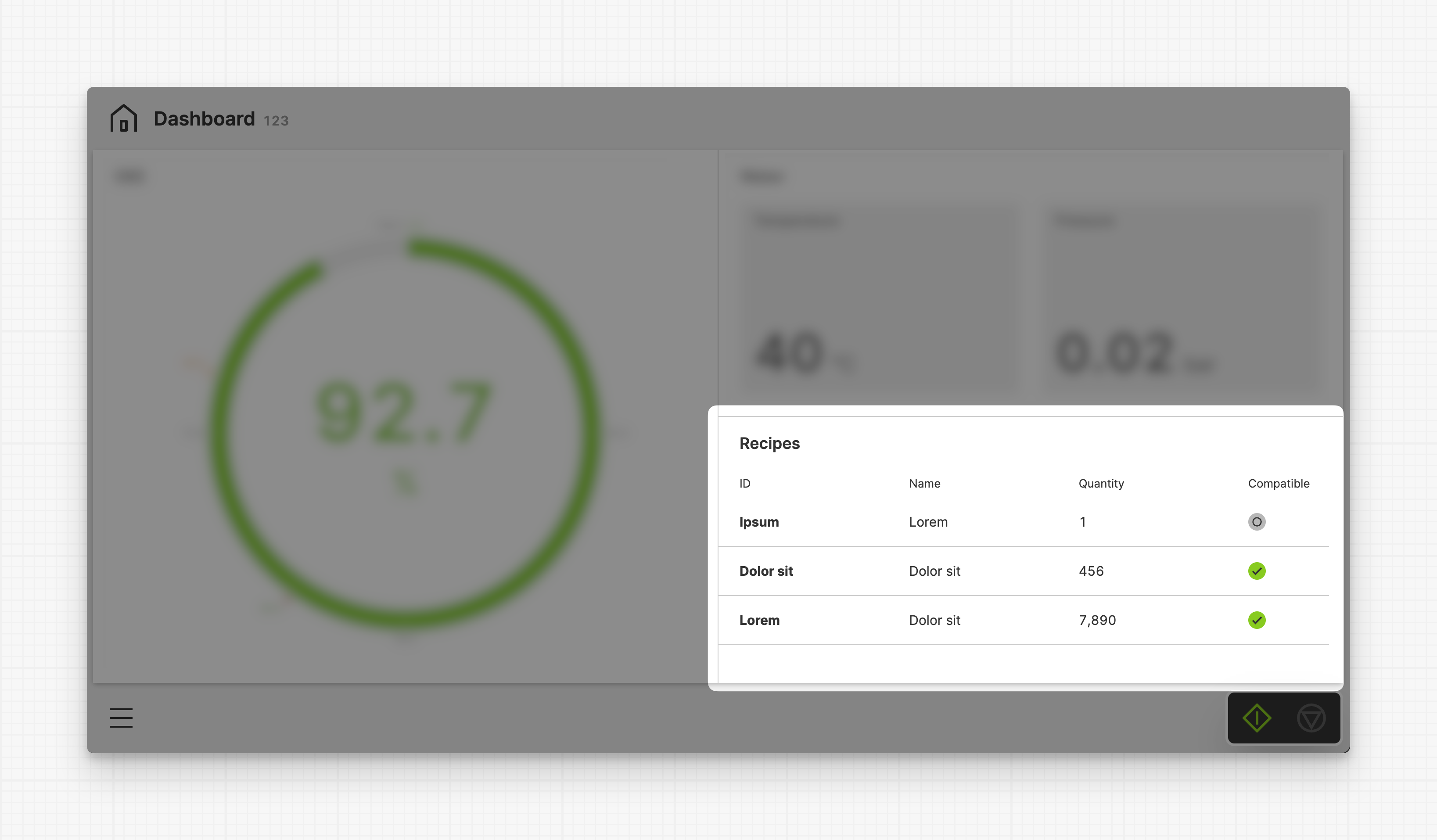
Collection Widget
Use the Collection Widget to display collections, such as recipes or active
tools, directly inside your Dashboard. Just like on the
Collection Page, you can add a Detail view to
this widget, allowing operators to expand the items.
Properties
Container
This icon will be displayed next to the element's label on pages that support it, like the Dashboard Page. An Element can make use of the icon to:
- Provide more context to add meaning
- Improve recognition and discoverability, especially on larger pages
Data Source
PLC
List property lets you choose a List that should be used as the data source for this Collection.DatabaseEarly Access
Please note that this feature is currently in early access and it only supports SQLite databases which need to be configured manually within the project.
- Choose a
Databaseas the source for this collection. - Choose a
Tablewithin this database that you you want to display using this the collection.
Main Action
Button that will be displayed in the upper right corner of the widget. By pressing it, users can execute an action.

Action that gets executed when clicking the button. Use it to:
- Open maximized versions of your widget content using the Open Page as Overlay Action.
- Navigate to other pages using the Navigate to Page Action.
- Execute logic on your PLC using the Write Data Variable Action or Call Data Method Action
Detail View
Placement
Select whether the overlay should be displayed in the center of the screen or on any side of the display.
Size
Choose how large you want the view to be. Choose between Full,
Medium, or Small.
Sorting
Add a default order to the collection to make sure it's arranged in the right sequence. To do that, just choose the property you want to sort by and the order (ascending or descending).
Display Condition
true or false you're good to go.