Collection Page
A Collection Page gives operators a general idea of a big list of items and
optionally allows them to edit these items using a Detail view. By default,
the list is being shown as a table that you can scroll up and down, with easy
sorting and filtering of the items.
Ever Wondered Why It's Called Collection Instead of Table?
Collection Instead of Table?Great question! The answer is quite simple: because a table is just one
particular way to visualize a large list of elements. Since the core
principle of HELIO is the separation of content from style, there is a good
reason for the name Collection page. In future versions, HELIO will support
more options to turn lists into other things.
So stay tuned or get in touch with our professionals if you have special ideas how you would like to visualize your lists.
Characteristics
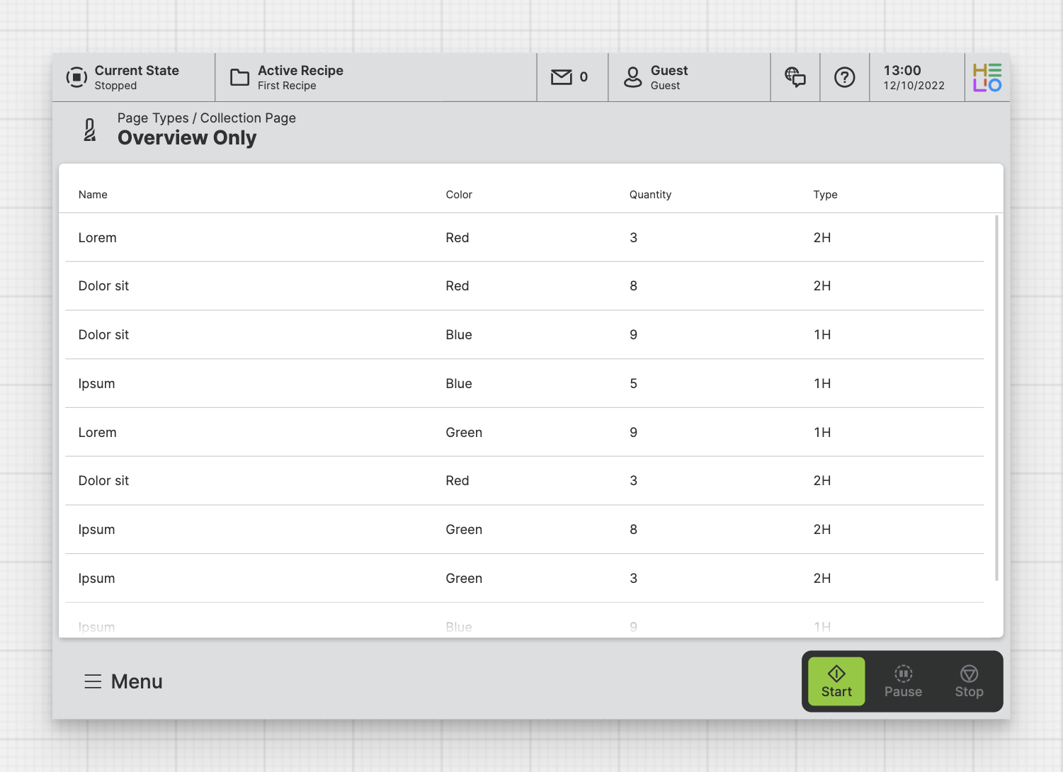
A Collection Page lets you visualize a List structure. By
default, it's shown as a table. You can choose which properties of the blueprint of the
linked Data Source you would like to be displayed on the overview page.
Anatomy
Title and Icon
Property
Footer
Properties
Data Source
PLC
List property lets you choose a List that should be used as the data source for this Collection.DatabaseEarly Access
Please note that this feature is currently in early access and it only supports SQLite databases which need to be configured manually within the project.
- Choose a
Databaseas the source for this collection. - Choose a
Tablewithin this database that you you want to display using this the collection.
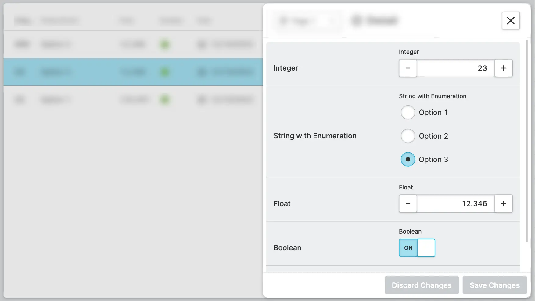
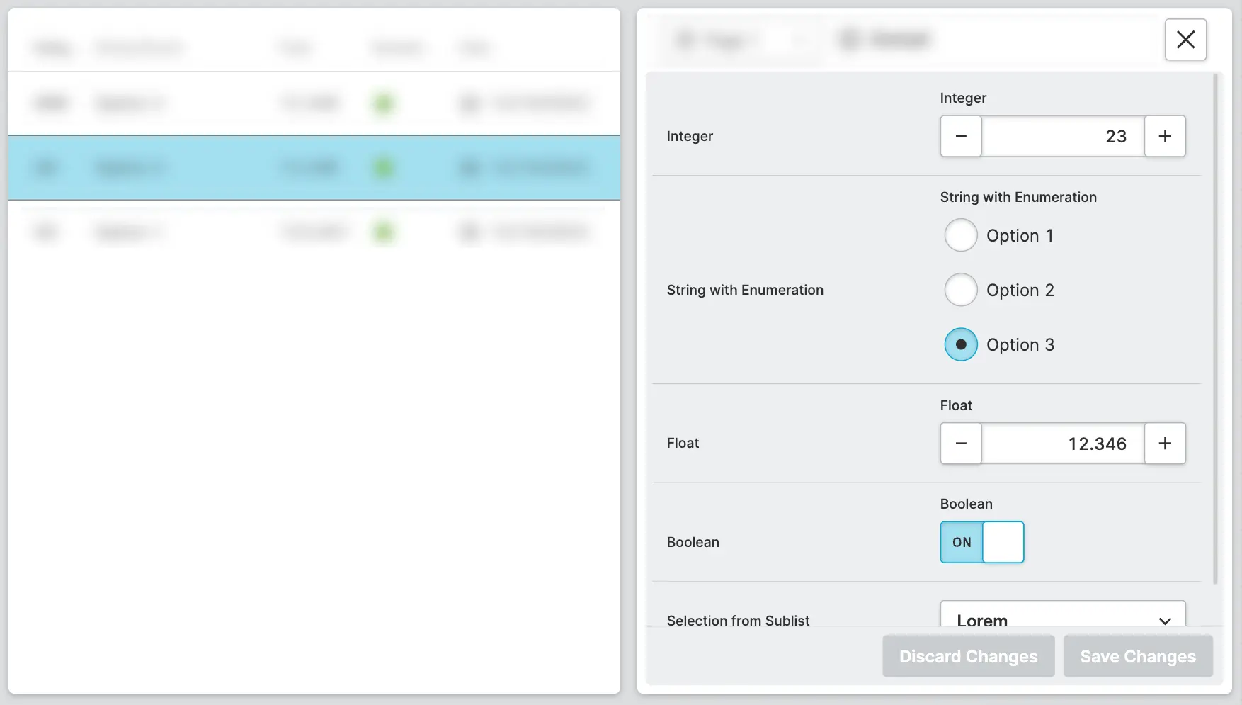
Detail View
The detail view renders the currently selected element of the collection. You can specify how this view should be displayed.
- As Overlay
- As Side Panel
The Detail View will open as an overlay in front of the collection. The
collection will be dimmed by a backdrop, and clicking on the backdrop will
close the view.
Placement
Select whether the overlay should be displayed in the center of the screen or on any side of the display.
Size
Choose how large you want the view to be. Choose between Full,
Medium, or Small.
The Detail View will open side-by-side with the collection. This allows
operators to quickly select and view other elements in the collection.
Side Panel slot of the page.Size
Choose how large you want the view to be. Choose between Full,
Medium, or Small.
Filter
Give your operators the ability to filter your collection based on specific properties. Right now, filters are only available for:
- Properties of type Date
- Properties of type Integer and String that use Enumerations
Search
Enable operators to search within your collection. Please note that this functionality is only available for collections that use a PLC list as a datasource.
Sorting
Add a default order to the collection to make sure it's arranged in the right sequence. To do that, just choose the property you want to sort by and the order (ascending or descending).
Side Panel
Size
Size that will be applied to the side panel content.
Display Condition
true or false you're good to go.Slots
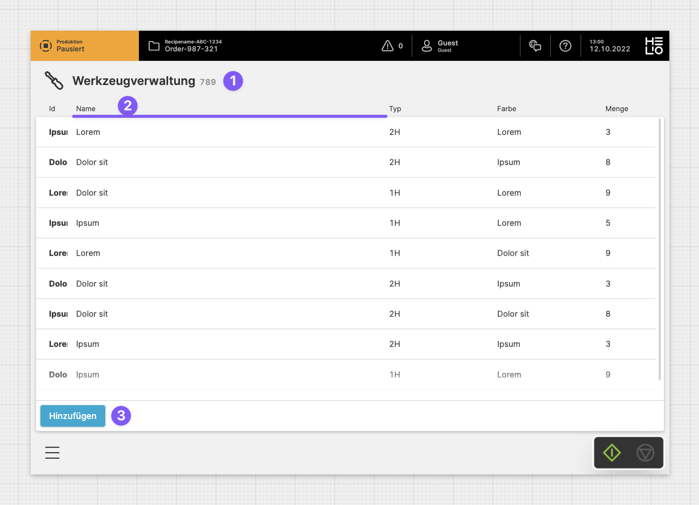
Properties
Choose which properties of the list you actually would like to show.
Child Elements
Detail
The Detail slot determines the page that should be displayed when an item has been selected.
Child Elements
Side Panel
NewPlace visual elements, such as an Image or Gauge, next to your collection.
For example, when displaying a collection of selectable or activatable
items, you can visualize the outcome of this selection close to the list.
Footer
Allows you to add action buttons to the footer, which will always be visible at the bottom of the page. Use this feature for significant actions that can be triggered on this page. It's perfect for the most important actions you can execute on a page.
Bear in mind that the footer does take up a bit of vertical screen space, something to think about if you're creating HMIs mostly for smaller screen sizes.
Child Elements
Related
Content