Image Page
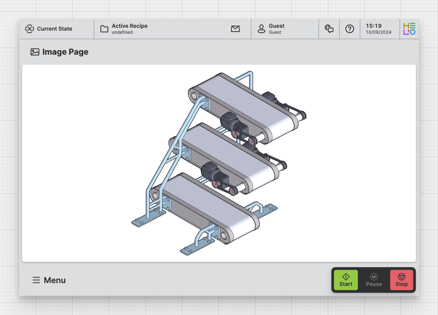
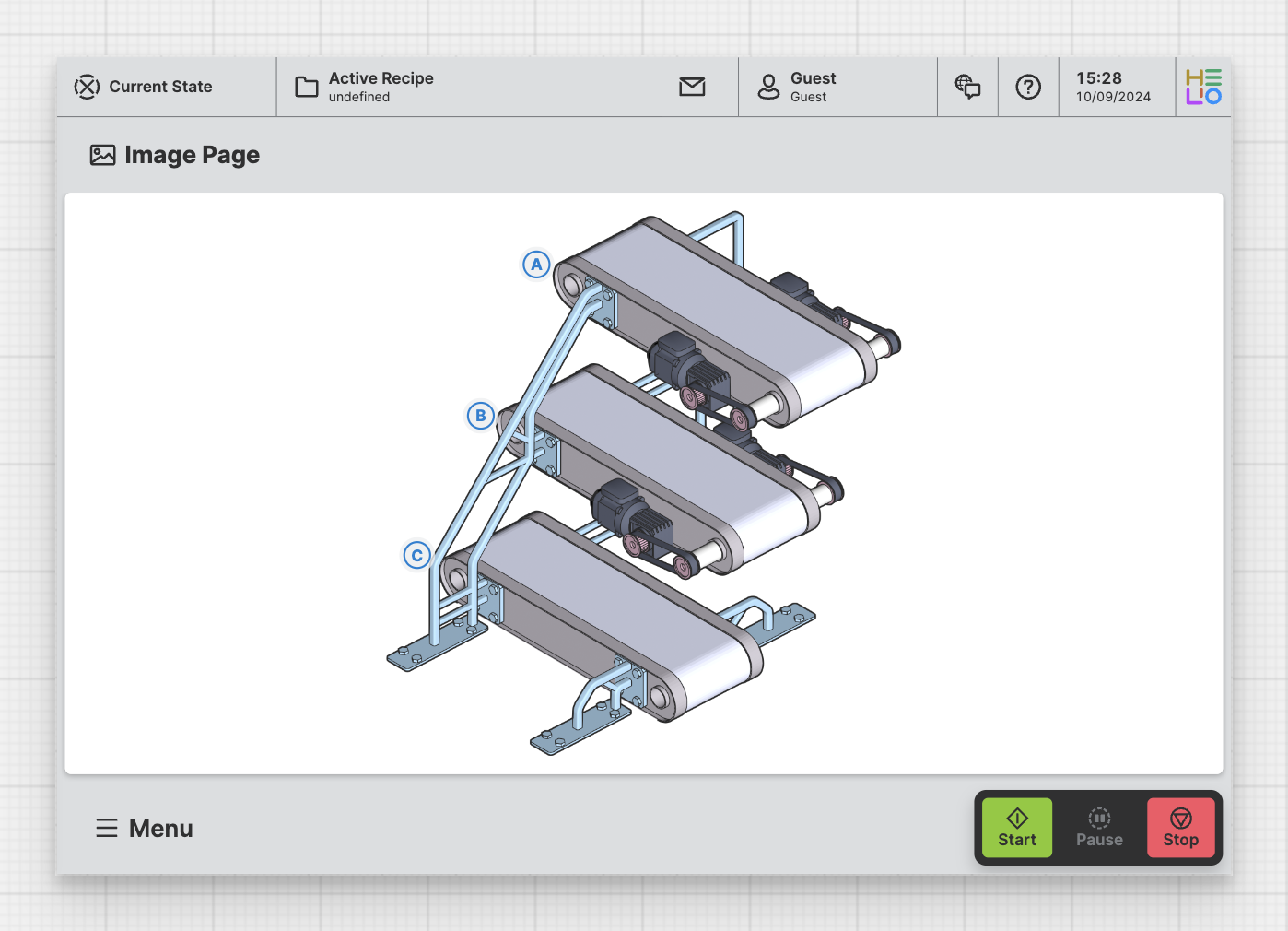
Purpose: Enable operators to view an Image and use previously set markers to view details or execute specified actions.
About
An Image Page is designed to display an image that can have multiple
markers. When clicked these markers can perform different actions according
to the needs of the HMI.
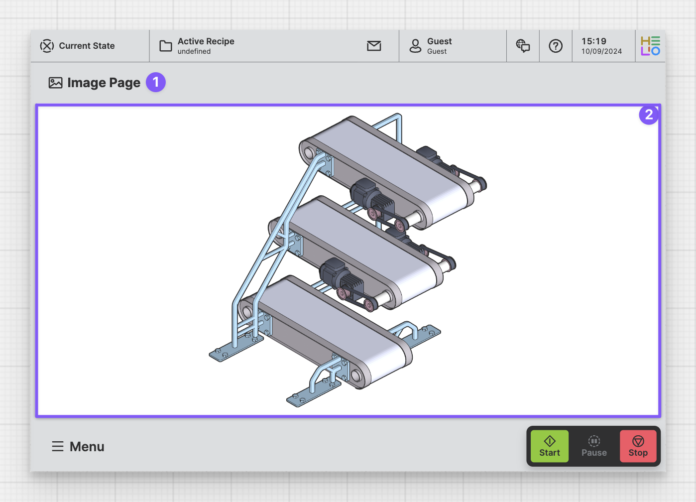
Anatomy
Title and Icon
Image
Properties
General
Title
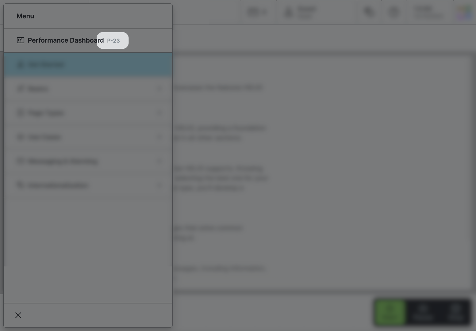
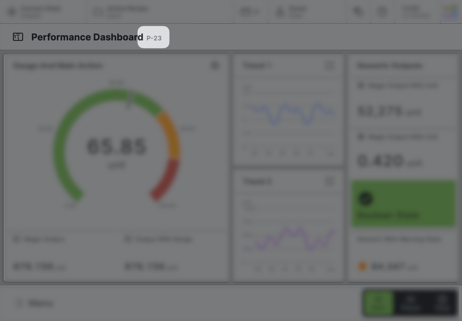
Page reference
This optional property lets you define unique short code that is human readable and helps to refer to that page without specifying its actual name. This is helpful especially in multilingual environments because
- It helps your Support-Team to quickly navigate users.
- It can be picked up by the product manual and documentation.
Icon
This icon will be displayed in the main navigation, the page header, and inside an embedded navigation of a Page Group.
Main Navigation
Show/Hide Page
Page Section Conditions
Page header
Display Condition
true or false you're good to go.Placing Markers
A very common use case is to place interactive markers on images and display help or page overlays. See Image for details.
