Tab Group
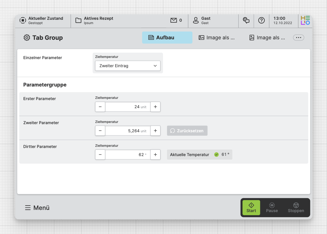
Group related pages together and switch between them using tabs.
Get Started With Tab Groups
To watch this embedded YouTube video, you need to accept the marketing cookies.
Characteristics
Think of Tab Groups as a family tree for your pages. A group is like a
parent - it doesn't have its own content, but it looks after its child
pages.
It can be navigated using the Tabs at the top of the page or using the main navigation menu.
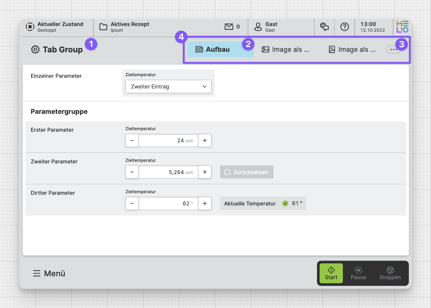
Anatomy
Tab Group Title and Icon
Currently Selected Tab
Tab Overflow
All Tabs within the Tab Group
Properties
General
Title
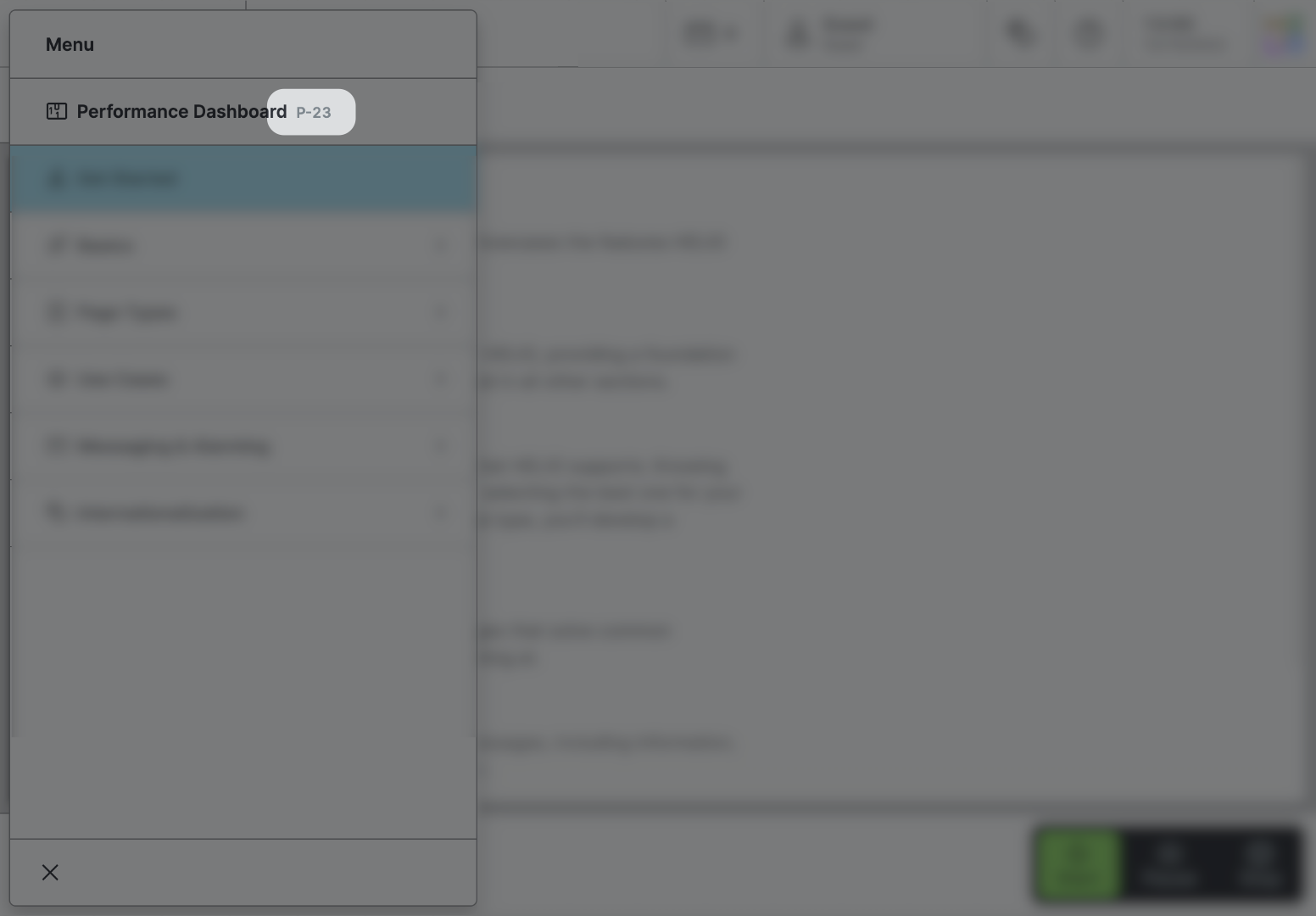
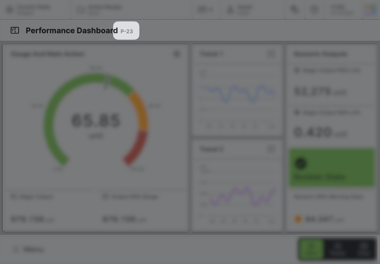
Page reference
This optional property lets you define unique short code that is human readable and helps to refer to that page without specifying its actual name. This is helpful especially in multilingual environments because
- It helps your Support-Team to quickly navigate users.
- It can be picked up by the product manual and documentation.
Icon
This icon will be displayed in the main navigation, the page header, and inside an embedded navigation of a Page Group.
Main Navigation
Show/Hide Page
Page Section Conditions
Page header
Sizing
Select whether the tabs of this Tab Group should fit to their content, should fill the entire Page header, or should have a fixed size that you can set in px.
Max Width
Choose the maximum width for the tabs of the Tab Group. This will ensure a relatively uniform appearance in "Fit Content" mode.
Width
Decide how wide the tabs of your Tab Group should be in "Fixed" mode. The more narrow your tabs are, the more tabs will fit on one page. But remember, the tabs will also have less space to display their title and icon, so choose a width that fits your needs!
Display Condition
true or false you're good to go.


