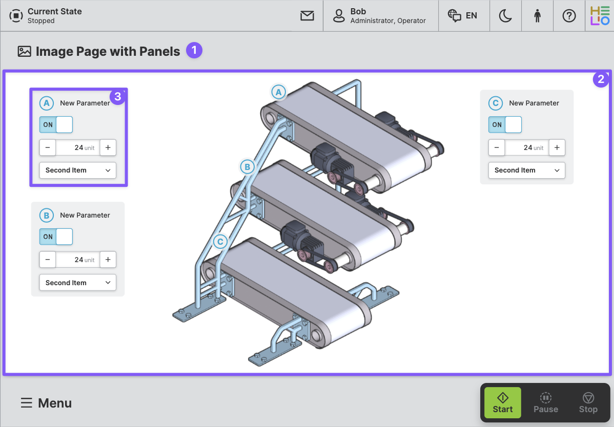
Image Page With Panels
Purpose: Display a background image and then place interactive panels above it. Within the panels, you can allow operators to edit parameters or trigger actions. Use image markers and panel legends to create an interactive connection between the image and the content above it.
About
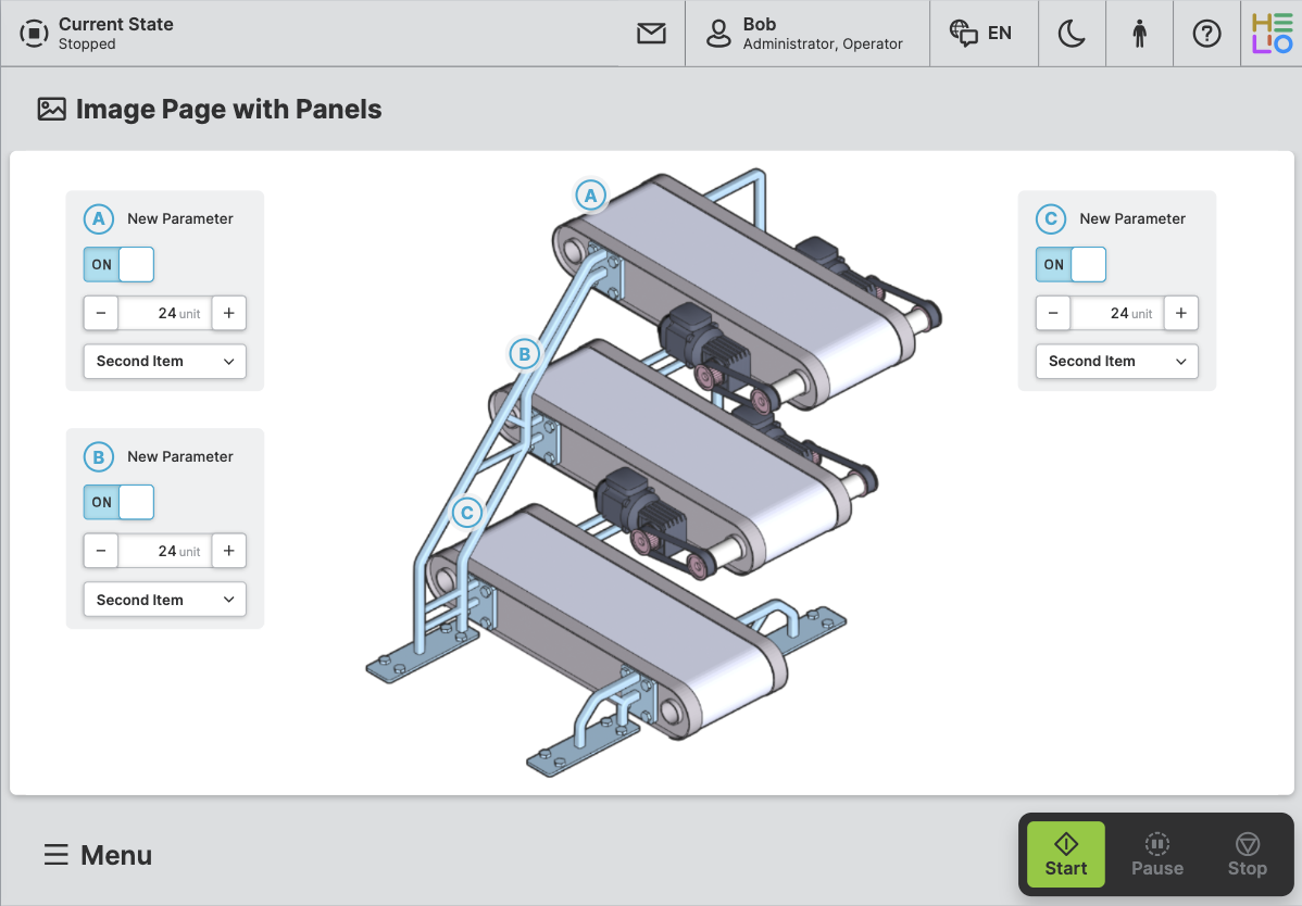
An Image Page With Panels is designed to display image with one or more
panels on top of it. These panels can be placed anywhere on the image grid and
can contain inputs, outputs, buttons, progress bars, and more.
Anatomy
Title and Icon
Image
Panel
Properties
General
Title
Page reference
This optional property lets you define unique short code that is human readable and helps to refer to that page without specifying its actual name. This is helpful especially in multilingual environments because
- It helps your Support-Team to quickly navigate users.
- It can be picked up by the product manual and documentation.
Icon
This icon will be displayed in the main navigation, the page header, and inside an embedded navigation of a Page Group.
Navigation
Show/Hide Page
Page Section Conditions
Page header
Panel Positioning
Grid step size
Select the grid size on which you would like to place your panels. Make sure the background image adheres to the same grid.
Use a coarse grid for simple layouts with a few elements, and use a finer grid for complex, detailed layouts that require more precision.
Display Condition
true or false you're good to go.