Overlay Panel
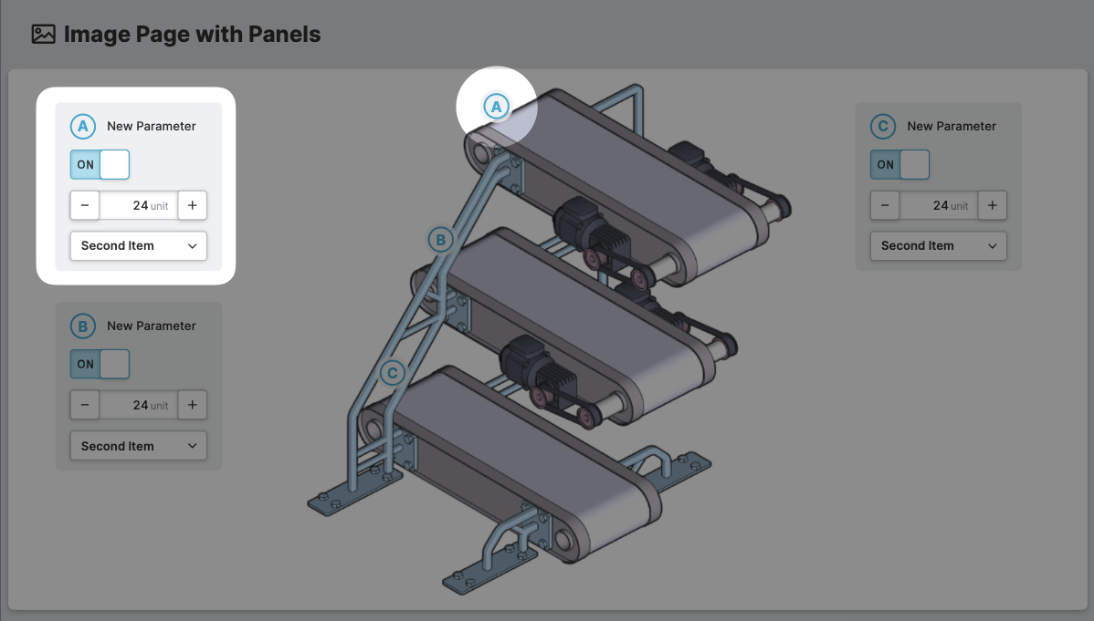
An Overlay Panel can be placed on the
Image Page With Panels. It can be positioned above the
background image by setting its X and Y coordinates based on the underlying
grid.
Anatomy
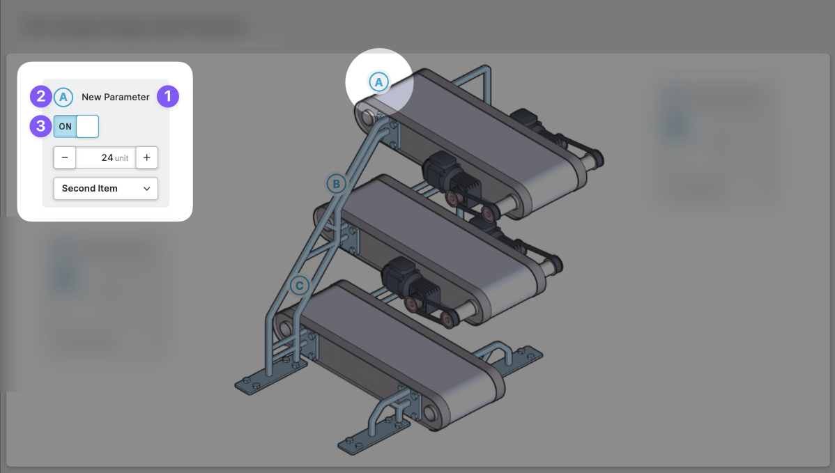
Label
Legend
Input
General
This icon will be displayed next to the element's label on pages that support it, like the Dashboard Page. An Element can make use of the icon to:
- Provide more context to add meaning
- Improve recognition and discoverability, especially on larger pages
Legend
Use the legend to reference specific points of interest on visualizations, such as images.
- The legend can be an alphanumeric value but it is limited to two characters.
- For instructions on how to add such markers to your images, refer to the Image page.
- To highlight a
Parameterwith a specific legend, use the Highlight Legend on Current Page action.
Position
Set the position of your overlay panel. Use the arrow keys or simply set an x and y value. This will position the panel on your image within the grid you have selected on the Image Page With Panels.
Columns
Column count
Decide how many columns your overlay panel should have. If you choose more than one column, you can place elements side by side on this panel.
Column width
Specify how many grid steps you would like one column of this panel to span. This controls the width of the panel. Note that the grid step size is defined on the parent Image Page With Panels, ensuring that all panels snap to the grid.
Display Condition
true or false you're good to go.