Dropdown (From Enumeration)
About
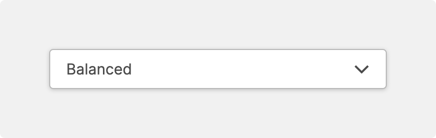
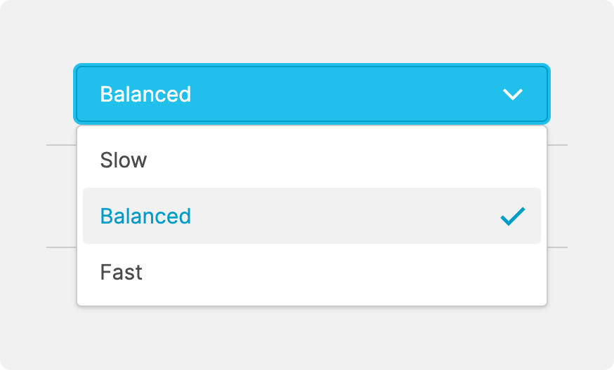
Use a dropdown if you want to provide operators with a list of options to choose from.
To generate this list, the data variable linked to this element must have certain properties set, most importantly the Enumerations.
Properties
General
Data Variable.Is disabled
Use this property to disable the element in certain situations, such as when your PLC is in a state where manipulation should not be possible.
Container
This icon will be displayed next to the element's label on pages that support it, like the Dashboard Page. An Element can make use of the icon to:
- Provide more context to add meaning
- Improve recognition and discoverability, especially on larger pages
Main Action
Button that will be displayed in the upper right corner of the element. By pressing it, users can execute an action.
Action that gets executed when clicking the button. Use it to:
- Open overlays that provide additional context or detailed controls for this element using the Open Page as Overlay Action.
- Navigate to other pages using the Navigate to Page Action.
- Execute logic on your PLC using the Write Data Variable Action or Call Data Method Action
Control Type
Effortlessly switch between a dropdown, a radio group, or a button group.
Options
By default, the Enumeration linked to the value provides all option labels.
However, you can overwrite the options to set a page-specific label or add an
icon for each option.
Display Condition
true or false you're good to go.