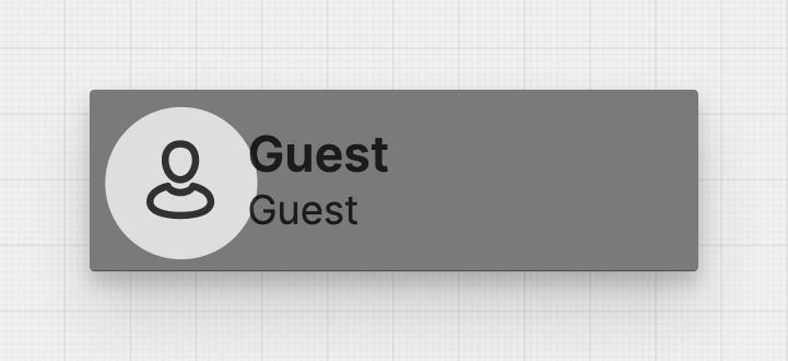
Header Cell
About
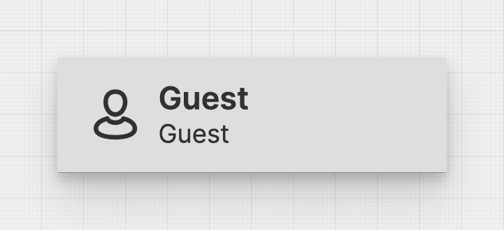
Header Cells make up the header of your HMI. They can display various types of information, including machine status, user data, alarms, and the current time.
Properties
General
Display
Choose whether to display only text, only an icon, or both within the Header Cell.
Select the title of the Header Cell. This text will be more prominent and should contain the most important information.
Select the subtitle of the Header Cell. This text will be less prominent and should contain less important information.
Display a Badge within the Header Cell. Use this to convey important information, like unread messages or errors.
On click
This is triggered once the user has clicked or touched and then released the pointer over the Header Cell.
Apply Status
From Value with Ranges
Use this option, if the variable linked to Value provides status information. This will allow you to automatically apply the status from Value to indicate the quality of the value as either Good, Warning, Critical or Accent.
Learn more with the following resources:
Manually
-> For more information: visit Status.
Sizing
Choose whether you want to set a fixed width for this Header Cell or whether it should shrink to fit its content.
Width
Select the width of the Header Cell.
Maximum Width
Choose the maximum width for the Header Cell. This will ensure a relatively uniform appearance in "Fit Content" mode.
Responsive Behavior
Keep visible as long as possible
Display Condition
true or false you're good to go.