Dropdown Cell
About
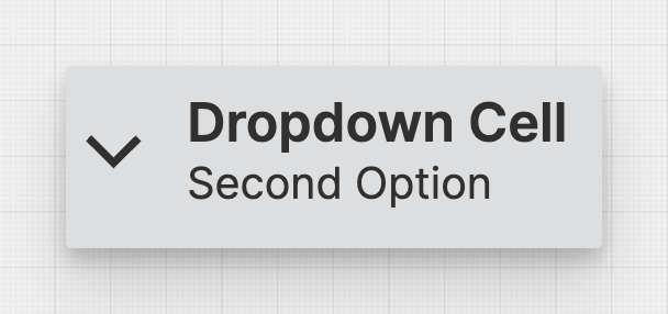
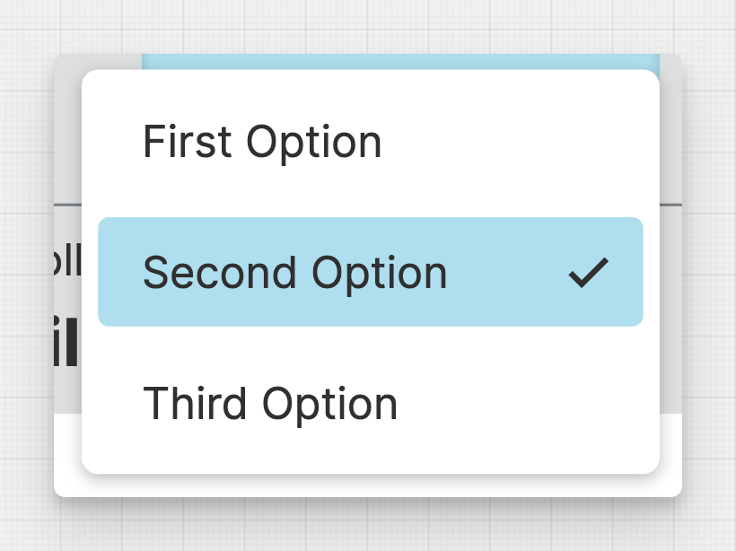
Dropdown Cells are a special kind of Header Cells. They provide operators with a list of options to choose from.
To enable the dropdown function of this cell, the linked data variable must have the Enumerations property set.
Properties
General
Display
Choose whether to display only text, only an icon, or both within the Dropdown Cell.
Select the title of the Dropdown Cell. This text will be more prominent and should contain the most important information.
Value
Choose the Enum Value to display within the Dropdown Cell.
Apply Status
From Value with Ranges
Use this option, if the variable linked to Value provides status information. This will allow you to automatically apply the status from Value to indicate the quality of the value as either Good, Warning, Critical or Accent.
Learn more with the following resources:
Manually
-> For more information: visit Status.
Sizing
Width
Select the width of the Dropdown Cell or choose wether you want the Dropdown Cell to shrink according to it’s content.
Responsive Behavior
Keep visible as long as possible
Display Condition
true or false you're good to go.