Footer Button
About
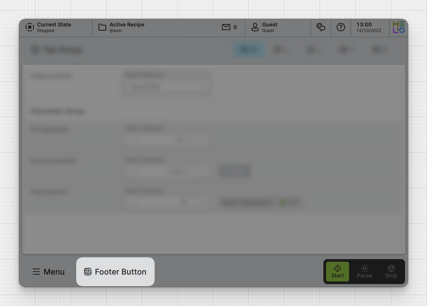
A footer button is a button within the footer of the HMI. This button will almost always be visible and should be used for the most important actions or navigation.
Properties
General
Decide whether the Footer Button should be highlighted or determine specific cases for when it should be.
Decide whether the Footer Button should be blinking or determine specific cases for when it should be.
On click
Triggered when the user clicks or touches and releases the pointer over the Footer Button.
Icon
Apply Status
From Value with Ranges
Use this option, if the variable linked to Value provides status information. This will allow you to automatically apply the status from Value to indicate the quality of the value as either Good, Warning, Critical or Accent.
Learn more with the following resources:
Manually
Determine manually which status should be displayed by the element.
-> For more information: visit Status.
-> For more information: visit Status.
Display Condition
The Display Condition controls the visibility of an element or page for the current user. The condition can be set to different types of Dynamic Property – as long as the the type returns
true or false you're good to go.