Create a Control Element
Elements are the fundamental building blocks of HELIO HMIs. They can be controls, widgets, pages, or any other visual component that users would like to add to their HMI. This guide walks you through creating a basic custom control element using the createElement() function.
1. Basics
Before creating the element, let's quickly review some basic concepts and terms you should know:
What Is a Namespace?
Namespaces make sure that every element, action, and dynamic property has a globally unique ID. They help prevent naming conflicts between the elements found in your Extensions. Think of a namespace as a unique prefix that helps keep your code organized and conflict-free.
It's like putting all the stuff from your extension into its own folder so it doesn't accidentally clash with anything else in your HELIO projects.
Why Do Namespaces Matter?
Take, for example, a custom element named StatusIndicator. Multiple developers
or even multiple companies might use the same names for such an element.
Without namespaces, that could lead to conflicts or unexpected
behavior. By giving your extension its own namespace, you make sure everything
stays clean and separated — no mix-ups, no surprises.
What Does a Namespace Look Like?
Your namespace becomes part of the unique ID of your Custom Elements.
So in our example, the custom element named StatusIndicator is part of the
my-extension namespace of your company. So the namespace would be
com.my-company.my-extension and the actual ID of your element will be:
com.my-company.my-extension.StatusIndicator. This ensures that this ID will
never collide with elements from other extensions, or companies, even if other
extensions use the same element name StatusIndicator.
What Is an Element?
An Element is a fundamental building block of an HMI — a control, widget or
visual component that you can add to a page and configure. Think of it like a
ready-made piece of interface.
Elements
- Render visual content in the HMI.
- Appear in the HELIO IDE's
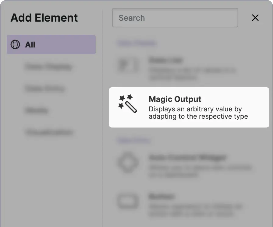
Add Elementdialog in the Project Editor. - Are configured using properties that are displayed in the Properties Panel of the Project Editor.
- Can be placed in specific parts of an HMI based on their Traits.
Custom Elements Let You
- Create custom UI controls (buttons, gauges, dashboards, etc.) that are tailored to your needs.
- Encapsulate visual logic and interactivity, so you can reuse them across projects.
- Enhance and extend the HELIO library with functionality you need that isn't available out of the box.
What Is a Trait?
Traits define the type and capabilities of your Custom Elements. They tell HELIO where and how your element can be used.
Common Traits Include:
traits.Controlcan be added to a Dashboard Page, a Dashboard Widget, or a Parameter Page.traits.Widgetcan be placed on a Dashboard Page.traits.Pagelet you create pages that take up the whole viewport of your HMI and will be made available in the main navigation.
In general elements can have multiple traits, allowing them to be
used in different contexts. But traits.Widget and traits.Control cannot
be used together. Therefore, an element cannot possess both of these
characteristics; it is either a widget or a control.
What Is a Props Schema?
A Props Schema lets you configure the API for whatever you build with the SDK — like Custom Elements, Custom Actions, and custom Dynamic Properties. It lets you control what properties your users can configure in the HELIO IDE.
These properties will show up in the Properties Panel of the Project Editor whenever an item of your extension is added or selected.
You define a props schemas by using the createPropsSchema() function.
Props Schemas Specify
- What properties are available and how they are called
- The types of these properties (text, numbers, etc.)
- The default property values for new instances
- Validation rules
2. Example
The following example demonstrates a minimal custom control element that can be added to a Dashboard Page, a Dashboard Widget, or a Parameter Page.
import { createElement, createPropsSchema, traits } from '@hmiproject/helio-sdk';
import { namespace } from '../../namespace';

export const controlElement = createElement(namespace, {
  name: 'Control Element',
  description: 'An element that can be added to Dashboard and Parameter Pages',

  traits: [traits.Control],

  propsSchema: createPropsSchema().initial({
    // Add your custom props here.
  }),

  Component() {
    return <div>Control Element Content</div>;
  },
});
L1Import the necessary functions from the SDK. The createElement() function is the core function for defining actions, while createPropsSchema() and traits are a utilities supporting it.
L2Every element needs to live within a Namespace to prevent naming conflicts. So you import the namespace you have created in the Create a Namespace guide.
L4Use createElement() to create the element in your namespace and export it so you can later use it in other modules.
L5-6L8The traits.Control allows your element to be added to Dashboard Pages,
Dashboard Widgets and Parameter Pages.
L10-12The propsSchema property defines the properties of your element that can be edited
in the HELIO IDE with the help of a Props Schema.
Note that the Control trait automatically gives your element standard
properties like Title and Icon, so you only need to configure props
that are specific to your element.
Congratulations! You now understand the basic structure of elements and can start building more customized components tailored to your specific needs.
