Develop Your Extension
Now that you've set up your extension project, it's time to move on to creating your first custom element. You will develop a simple traffic light indicator that changes color based on a threshold value.
1. Let's Build a Traffic Light
Let's start with our main idea. We're going to use plain React to build a super
simple traffic light. Go ahead and create a file called
src/components/TrafficLight.tsx and paste in the following code:
type Props = {
  value?: number;
  threshold?: number;
};

export function TrafficLight(props: Props) {
  const { value = 0, threshold = 0 } = props;
  const isOk = value < threshold;
  const color = isOk ? '#4ade80' : '#ef4444';

  return (
    <div style={{ width: '100%', height: '100%', display: 'flex', alignItems: 'center' }}>
      <div style={{ background: color, borderRadius: '100%', width: 32, height: 32 }} />
    </div>
  );
}
L1-4Define the API aka the Props of our component and define two optional, numerical properties threshold and value.
L6We define a component that uses these props and choose 0 as a default value for both properties if these are missing.
L7-8We compare the value to the threshold and choose #4ade80 if the value is below and #ef4444 if above the threshold.
L11-15We'll use CSS to make a container that stretches to the full size of its parent and puts a centered circle inside of it. Don't worry, young Padawan. For now, it's totally fine to use inline styles. Other styling techniques are also supported – but that's a story for another time.
2. Preview and Test in Storybook
Time to see your component in action! Wouldn't it be great if you could take a look at the component on its own without having to install it in HELIO first? Storybook's a real lifesaver in these situations. It's a great tool for speeding up iteration cycles while developing components in isolation. That's why we included it in the extension template for you.
What is Storybook?
Storybook is an interactive development environment for UI components. Think of it as a sandbox where you can:
- See your elements render in real-time
- Adjust properties of your components using interactive controls
- Test different states without running HELIO
- Document your elements with examples
In order to do so, you first have to tell Storybook about the new component. In
other words: you create a story that describes the component. Go ahead and
create a file called src/components/TrafficLight.stories.tsx and paste in the
following code:
import type { Meta, StoryObj } from '@storybook/react-vite';
import { TrafficLight } from './TrafficLight';

const meta = {
  component: TrafficLight,
  tags: ['autodocs'],
  args: {
    value: 40,
    threshold: 50,
  },
} satisfies Meta<typeof TrafficLight>;

export default meta;

type Story = StoryObj<typeof meta>;

export const Default: Story = {};

export const Warning: Story = {
  args: {
    value: 60,
  },
};
L2L4-11L17-23Default and the Warning case. For each story, we set the value and threshold.To start Storybook, run the following script:
After a few seconds, Storybook will open in your browser and this is what you'll see:
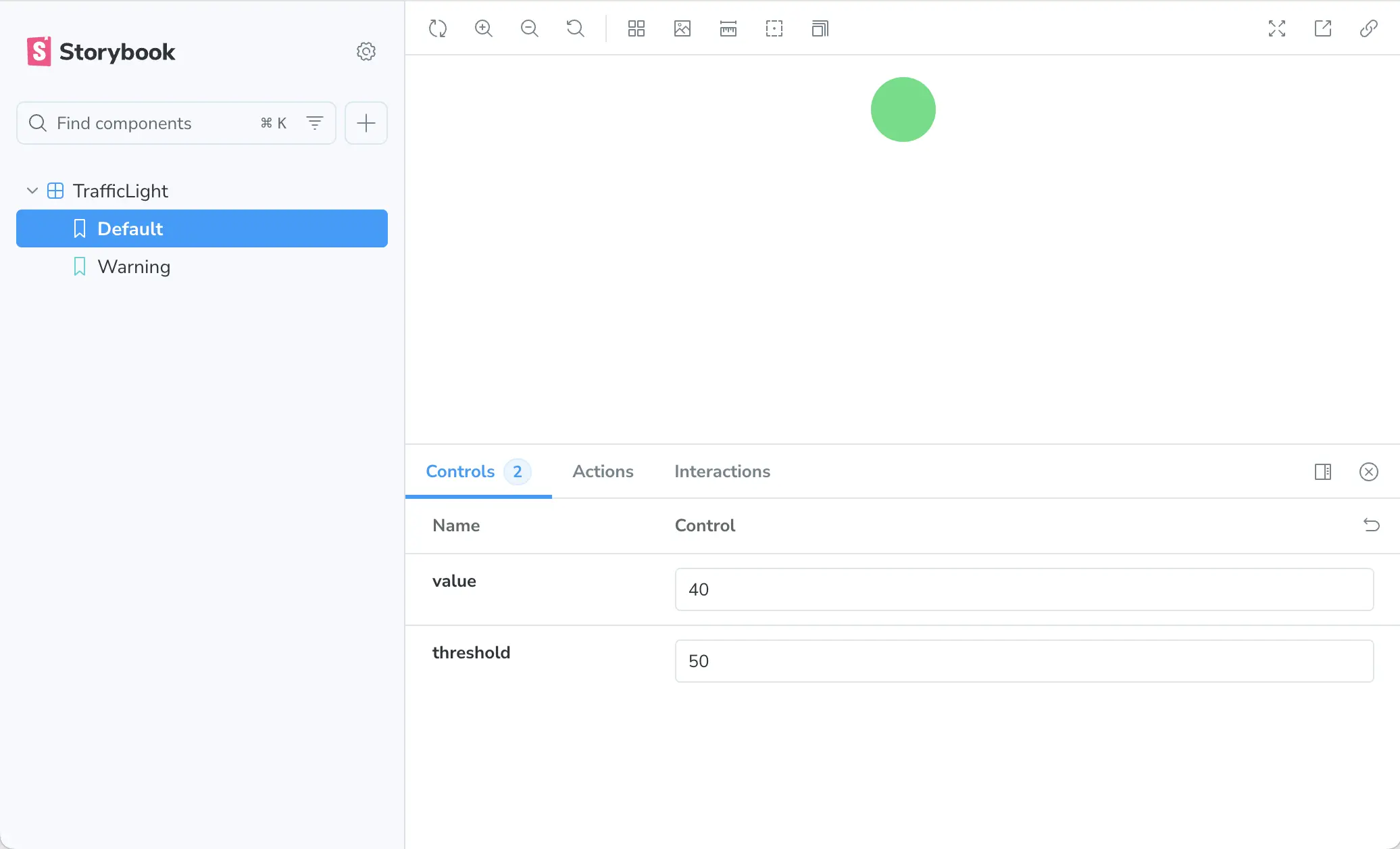
- Find your
TrafficLightcomponent listed in the sidebar - Your element will be rendered in the center of the screen.
- Interactive controls for the properties of your component:
valueandthreshold
Play Around With It!
Adjust the value slider below 50 - the light should be green. Move the value above 50 to turn the light red.
Hot Reloading FTW!
Make changes to your component code and save - Storybook will automatically reload to show your updates. No need to restart!
3. Define a Namespace for Your Elements
Your component is ready for prime time, now let's hook it up into HELIO. But before we get into the nitty-gritty of registering your new HELIO element, you'll need a namespace. Think of it as your extension's unique address space that prevents naming conflicts with other extensions.
If you open src/namespace.ts, you'll see that a default namespace has already
been created for you.
Adjust this file for your extension:
- Name the first part of your namespace using reverse domain name notation.
- You can add extra segments, because you might create multiple HELIO extensions in your company, and you do want to prevent naming collisions with elements from those extensions. We're just going to keep things simple and stick with the existing 'my-extension' for now.
import { createNamespace } from '@hmiproject/helio-sdk';

export const namespace = createNamespace({
  name: 'com.my-company.my-extension',
});
A HELIO namespace must be provided in reverse domain name notation (e.g. com.my-company) and can include additional segments (e.g. helio.trend-controls).
Why Namespaces Matter?
Your namespace becomes part of your element's ID. Whenever somebody adds one of your elements into the IDE this ID be stored within in your project.
For example, a "StatusIndicator" element in the traffic-lights namespace
becomes traffic-lights.StatusIndicator. This ensures your elements won't
collide with elements from other extensions, even if they have the same name.
Automatic prefixing: All your elements, actions, and dynamic props automatically get prefixed with your namespace.
For more details, check out the createNamespace() documentation in the SDK API.
4. Define the Custom HELIO Element
Now that your namespace has been properly set up, you can introduce your custom element and configure its schema so that HELIO knows which properties to make configurable for your users within the HELIO IDE.
Create a new file src/elements/TrafficLightElement.tsx and paste the following
code:
import { createElement, createPropsSchema, dynamicProperties, props, traits, useDataVariable, values, } from '@hmiproject/helio-sdk';
import { Fragment } from 'react';
import { TrafficLight } from '../components/TrafficLight';
import { namespace } from '../namespace';

export const TrafficLightElement = createElement(namespace, {
  name: 'Traffic Light',
  description: 'Displays a simple traffic light using a value and a threshold',
  traits: [traits.Control],
  propsSchema: createPropsSchema().initial({
    value: props.DynamicProperty({
      label: 'Value',
      valueType: 'Integer',
      optional: false,
      defaultValue: dynamicProperties.DataVariable(),
    }),
    threshold: props.DynamicProperty({
      label: 'Threshold',
      valueType: 'Integer',
      optional: false,
      defaultValue: dynamicProperties.StaticValue(100),
    }),
  }),
  Component(props) {
    const value = useDataVariable(props.value, { valueType: values.Number() });
    const threshold = useDataVariable(props.threshold, { valueType: values.Number() });
    return (
      <Fragment>
        {value.render()}
        {threshold.render()}
        <TrafficLight value={value.value.raw} threshold={threshold.value.raw} />
      </Fragment>
    );
  },
});
L3-4First, you import the TrafficLight component, as well as the namespace
you've just configured.
L6Next, you use the createElement() function to define a new element within your namespace.
L7-8These lines define metadata that will be displayed within the HELIO IDE when adding new elements.
L9Next up: traits. This is a topic in and of itself. For now, all you need to
know is that you use traits to tell HELIO what kind of element you're
building. You'll want to be able to add your traffic light to a Parameter Page.
That's why you use the Control trait, since a Parameter Page
renders controls.
L10-23The propsSchema block is a powerful tool that lets you shape the API of
your new element. We define both value and threshold just like we did at the
component level, but now we've got a much richer palette of tools. HELIO
will use all this info to show the controls that let users configure this
element.
L21This is an interesting line. Here, you're providing a default value for the threshold property: a static value of 100. Keep that in mind, will you?
L24-35Finally, we've arrived at the code that renders your custom element. What
you see here is a React component that renders HELIO wherever your element
is placed. This is the place where you get data from HELIO using its
built-in hooks, like useDataVariable, and pass that data to your custom
components.
5. Register the Element in Your Extension
Just a heads-up, the release of your new extension is almost here. Before that, you have to properly configure the main entry point of your extension.
Every extension needs an entry point – it registers all the custom Elements, Actions, and Dynamic Properties that you'll be building within HELIO.
Open src/main.ts and adjust the code like this:
import { createLibraryExtension } from '@hmiproject/helio-sdk';
import { TrafficLightElement } from './elements/TrafficLightElement';

export default createLibraryExtension({
  // Name and description will be displayed in HELIO when installing
  // the extension in a project
  name: 'My Extension',
  description: 'Introduces a simple traffic light',

  // When you're upgrading your extension, use the version property and
  // semantic versioning. Let HELIO and your users know wether your extension
  // has undergone fundamental changes or only minor improvements.
  version: '1.0.0',

  // Let users know who is responsible for developing this
  // extension. Replace this with your company's name.
  author: 'My Company',

  // Specify which version of HELIO is required to execute this extension.
  minimumRequiredHelioVersion: '25.4.0',

  elements: [TrafficLightElement],
});
Your extension is fully wired up and ready for action.
Congratulations! You've created your first custom element and seen it running in Storybook. Next up: installing this extension in HELIO so you can use it in real HMI projects.